Nothing particularly ground-breaking here, am I right? Since the introduction of the <button> tag in HTML4, buttons haven’t been particularly challenging to make. Despite this, it’s relatively easy to find buttons that don’t adhere to the fundamental best practices, so in this blog we’re going to delve a little deeper into them.
Make Your Buttons Look Like Buttons
The key to buttons is that they must have a buttonlike appearance, with some shading on their surface or around their edges to distinguish them from the background and give them the appearance of being clickable.
Words by itself definitely doesn’t provide enough visual cues, nor does a shape around a word without any shading to make it look buttony.
A button may lose its button-like appearance if it is made too large. The photo displays a portion of the UK Web page where you can sign up to be an organ donor. It has four buttons: one for the primary action and three for the secondary actions. However, the primary action button is so big that it no longer resembles a button.

Despite the fact that it seems obvious to me that buttons should look like buttons, many website designers seem to be concerned that a sloppy old button would ruin the lovely lines of their design. Naturally, they could be right: we want that main action button to look fantastic in addition to looking like a button. Since it’s the only place your users will look, it needs to be visually appealing.
Put Buttons Where It’s Easy For Users To Spot Them
Is the OK button to the left or right of the Cancel button? It’s one of the most contentious issues in user experience. And there is also the issue of Next and Previous buttons. There are opinions everywhere, and they’re frequently supported by studies even actual research.
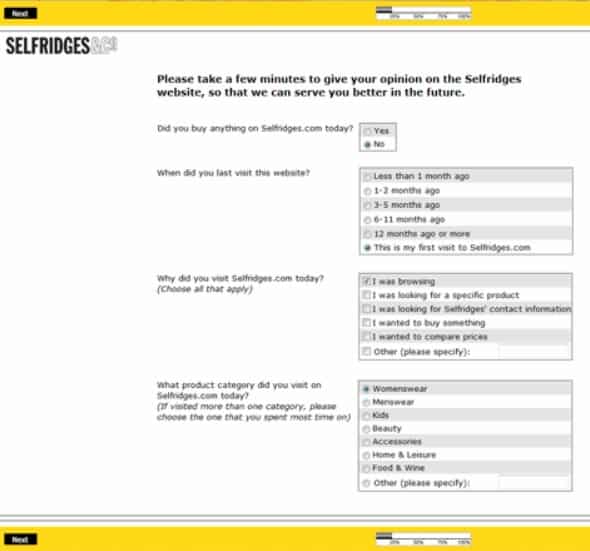
In our experience, there is usually just 2 buttons in a dialogue box or survey: OK and Cancel. Sometimes the buttons are Next and Previous in survey forms. This is usually preceded by a question or image. However, before users can proceed with an action button, what are they looking at? What will lead them to select Back or Cancel?
Generally speaking, when you’re on a web page, it’s all about knowing what catches your users’ attention which motivates them to take action. The image or text must inspire them to take action so that you know where to put the corresponding action button.
Put the primary action button, Next, OK, or Send, as close to the left-end of the final field on the form as you can because, in the world of forms and surveys, users have just tapped or clicked a field.
However, there are instances where CTA buttons are hidden. Take a look at this photo. There is an action button in the footer and another one hiding above the logo.

Make the Most Important Button Standout
Another strange technique for making it challenging for users to play “hunter-for-the-button-I-want” is to provide them with a lot of buttons arranged in a row that all look very similar.

Why not give users a bit of help and make the primary action button more prominent? It will appear more significant if it is made slightly larger. Additionally, it makes it easier for users to click on. Alternatively, use a more obvious color for the main action button—just don’t be too subdued. Our goal is to be obvious.
Put Buttons in a Logical Order
Where should the other buttons go if the main action button needs to be the first thing users look at?
It goes without saying that you should hide the other buttons so users won’t accidentally press them. This is good advice, but if you abide by it without considering other design factors, it might result in undesirable layouts like the one in the photo below.

For languages that read left to right, a Previous button should always be to the left of a Next button, so the answer here is to rearrange the fields and buttons. Another option would be to increase the left margin of the page and put the Previous button into it.
Label Buttons With What They Do
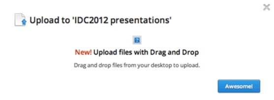
Sometimes we encounter buttons with strange labels. We can’t help but ask what they do. Take a look at the message on the photo after we uploaded a file. It provided me with just the Awesome button. What was the intended meaning of that? What effect had the button? How could I achieve my objective of making that presentation the best it could be?

This is an example of breaking the best practice to clearly label buttons with their functions.
If There is No Action Required, Then Don’t Put a Button for It
We have also encountered many forms with useless buttons. I try to fill them out honestly to see if they work, but I don’t really want to sign up for a website, apply for a loan, or do anything else that they might ask me to do, so I find a Reset or Cancel button rather handy.
We haven’t seen a Reset button on a form in a very long time, and even Cancel buttons are getting harder to find.
We also continue to see a lot of buttons that simply repeat the same action, so users get the feeling that they aren’t making any progress. For instance, I recently began the process of applying for a credit card. The primary action buttons from the first three steps are shown in the photo below. Since none of them offered me a form before I had even answered a single question, I quickly gave up on that process out of impatience.

Make It Hard to Find Destructive Buttons
Despite my arguments against providing users with buttons for actions they don’t want to take, there are times when we must provide harmful buttons, like Cancel This Order. This was one of the plausible Cancel buttons that I found in my library, from a Web site that is aimed at non-savvy users who were about to commit to a rather large purchase, with long-term monthly payments, and who might not realize that the Close the Window option would let them escape.
If you do need to include destructive buttons, you should definitely find a way to make them harder to find than the primary action button—for example, by making them look less buttony, smaller, or even turning them into links. Users who want to cancel or take other negative actions will split off and look for them. However, users who are happily working on their tasks are not caught in a terrible error.
Final Thoughts
A crucial part of these conversations is played by the modest button. A short form with a button that is immediately visible is good; a long form without a button above the fold might not be so good. When users first navigate to a page with a form, an appropriately easy-to-spot primary action button helps to show the extent of their task. Of course, the relationship—that is, the interaction between the objectives of the user and the evaluation of the entity posing the query—determines how this works.
The post UX Design: Best Practices for Buttons appeared first on Creativ Digital.
from Creativ Digital https://ift.tt/vCFTYyq
No comments:
Post a Comment