Tuesday, February 28, 2023

UX Design Mistakes To Avoid During App Development

It has now become hard to function without smartphones.

At the end of 2020, there were be roughly 3.5 billion smartphone users, as per Statista. In fact, the 2020 Digital Statshot report states that there are more connected devices than people in the world!

So what is the reason why smartphones have become indispensable? It’s the apps.

Nowadays, people rely on applications for all of their daily tasks, from waking up in the morning to communicating with friends to sending emails for work.

According to Statista, the industry is anticipated to generate revenues of about 581.9 billion USD by the end of 2020. While many might believe that creating an app in the modern world is a surefire path to success, this isn’t always the case.

Because of the increase in competition, it is now important to deliver optimum experience to the users. Anything less than perfect, and they will go over to the competition. This is why you need to perfect the UX design of your app.

Here are the top mistakes you need to avoid during app development.

Not Understanding Your Users’ Needs

One of the most common mistakes that designers make when developing an app is not understanding their users’ needs.

The first step in designing a product is to understand what your users need and expect from it. This can be done through interviews, surveys and observation. In addition to this, you should also consider how they use other products or websites that are similar to yours (if there are any).

The next step would be creating personas based on these findings – this will help you create user stories which describe specific scenarios where those users might experience pain points or problems with using your product. You should then build out mockups of these scenarios so you can visually see how they’ll look when implemented into the app.

Missing Calls to Action

The call to action is the most important element of any app. Without it, there’s no point in having an app at all. It’s what makes users want to use your product, and it can also be used as a way of ensuring that they return later on.

However, many apps hide their CTAs—and this can cause confusion for users who don’t know where they need to click next or even if they’re supposed to do anything. Make sure your CTAs stand out by making them bright, bold and easy-to-find so that people don’t have trouble finding what they need when using your app.

Overloaded UI
UX Designer: Tips For Achieving Post Launch Success

Great UX places a strong emphasis on simplicity; an overly complex interface will only confuse users and cause them to uninstall your app.

Unfortunately, adding too many features can easily make things too complicated.

Many make the mistaken assumption that users want all-inclusive, feature-rich apps that can perform any task. However, having too many options can cause indecision called the paradox of choice.

Fortunately, there is a relatively simple fix for overloaded interfaces—just trim them.

Naturally, it’s never simple. What if you have too many features in your app but are unable to delete any of them?

A good strategy is to personalize the app by limiting the features that are shown to a user to those that are relevant, thereby limiting the options.

For instance, TurboTax queries the user for the specific tax remedies they require. Then, in order to avoid clogging up the UI, it only displays these features.

The UI can occasionally appear cluttered for no other reason than bad design decisions.

As a result, you should always balance the text and visual components on your screen and arrange them in a logical order.

Poor App Copy

One of the essential UX components that developers frequently overlook optimizing is app copy. Unfortunately, poor copy will only alienate and confuse readers and confusion will only lead to churn.

Proper UX writing is the best way to prevent this. Its objective is to navigate users through your app in the most natural and uncomplicated way possible.

Let’s examine some recommended procedures.

A lengthy wall of text is the first thing you need to stay away from. By judiciously using whitespace, you can quickly resolve this problem. Try to break up the text into paragraphs that are 60 characters wide and no more than 9 lines long.

One of the pillars of good UX is keeping your copy concise and using the fewest words possible to convey the same meaning. You’ll be surprised at how much meaning you can fit into a few short, straightforward words.

Jargon, on the other hand, is a serious UX copywriting sin. Here, a good litmus test is: “Will an 8-year-old understand this?” You’re in the right direction if the response is “yes.”

A regular user probably won’t understand what “authentication error” means, but a developer would. Use of the active voice is also crucial. Because the copy in apps is there to tell users what to do, this is much more dynamic.

It’s also a good UX practice to use numbers. They not only make your copy shorter, but they also stand out more on the page. For instance, it has a much greater impact to see that your revenue increased by “512%” rather than reading “five hundred and twelve percent%.”

These best practices highlight the importance of clarity as a writing principle for app copy. You can greatly enhance UX by writing with clarity and directness.

Too Many Notifications

push notification

There’s a fine line between too many notifications and the right amount. Too many can be annoying, but too few can feel like nothing at all. If you have any doubt about whether or not your notifications are clear and concise, ask yourself if they are relevant to the app or person who has requested them. If it’s not clear why someone needs an update from you, then don’t send one.

You should also be mindful of how much information is being shared in each notification: Is there enough context for someone who might want that information? Are there other ways for them to find what they’re looking for easily on their own device? Do we need further explanation than just “here’s what happened today”?

Ignoring App Architecture

App architecture is the foundation of your app. It’s the way in which you structure your app and how it organizes information for users.

An app architect is someone who helps developers build great experiences for their users, but not everyone has an architect on staff at their company or even knows what this role entails. If you want to create an amazing user experience for your customers, then it’s important that you understand how apps are built from the ground up so that you can avoid these mistakes when developing yours.

Too Many Features

Too many features can be confusing for users. Users will have a hard time finding the features they need, and won’t use all of them. Users will also not be able to find the features they want because there are too many options available in the app’s interface.

Lack of Design Consistency

Design consistency helps users to understand the app and makes it easier for them to navigate. If you have a design that is inconsistent, then it will be more difficult for users to find what they are looking for, which may cause them to abandon your app. Design consistency also allows users’ eyes and minds to flow through content without having any difficulty in understanding how things fit together or in finding their way around the app.

Takeaway

UX is fundamentally about providing users with a seamless and enjoyable experience.

Start by staying away from the common errors we’ve listed here. But more than that, excellent UX is about understanding the user’s needs and providing a solution. And to support that, you must engineer every last aspect of your app. Even though it’s challenging, the effort is well worth it.

The post UX Design Mistakes To Avoid During App Development appeared first on Creativ Digital.


from Creativ Digital https://ift.tt/hzpcOVN

Sunday, February 26, 2023

How To Create a Conversion-Driven Ecommerce UX Design

The main goal of user experience (UX) design for an e-commerce website is to make the customer purchasing process enjoyable. UX design involves shaping each component of the e-commerce website so it results in a conversion. This includes all elements including esthetics. In fact, a web site’s esthetics have a significant impact on users’ perceptions of its legitimacy.

UX design structures the presentation of this information to convey both overt and covert messages to users by using information in the form of text and visual elements.   

Review Your Website for UX Design Issues

Understanding the current state of user experience is necessary before you can make improvements. Finding the Web site’s trouble spots is the first step in this process. An analysis, or audit, of an e-commerce Web site can be carried out manually or with the aid of tools that do the analysis for you. Understanding the current state of the user experience also requires knowing the status of an organization’s customer-support offerings.

You have to review user behavior on your website as part of this audit. Metrics like bounce rates, time on page, average page views, and conversion rates can help you understand user behavior. Each of these metrics provides a unique perspective on the user experience provided by your website.

This kind of analysis can assist you in identifying the user-experience issues you need to address to boost conversions. You can start working on developing solutions once you’ve determined the site’s shortcomings.

Generate a Theoretical Purchase Journey

Describe the user experience for your e-commerce website in a hypothetical purchase journey that goes from the marketing channel to the purchase order. Make sure to include every step a customer would take to purchase a product when you create such an outline.

By following these steps, you can break down the journey into pages, choose the user-interface components that will work best on each page, and then design each page of the website as necessary. Each page’s user experience should motivate customers to continue their purchase process.

You must simultaneously draw attention to appealing qualities and details about the goods and services you provide. You can use this information to dispel any client objections. For instance, you need to emphasize on your product details page that you are offering international air freight for quick delivery. This might draw clients who need a product right away.

The customer should get closer to making a purchase on your e-commerce website with each step in this process. The issues that a customer might encounter during the journey can be addressed using the insights from your UX audit, which will improve the user experience for the corresponding pages.

Simplify the Navigation

ecommerce website design
Enhance SEO With Coupons

It would be difficult for customers to find the product they were looking for if you displayed all your products at once. Customers can easily navigate from one page to another with a straightforward navigation system. Navigation system may include various product categories based on their type, use, or popularity. Alternatively, menus may direct users to key pages on your e-commerce website. The navigation elements must be positioned to maximize visibility for your most alluring products.

Navigation is enabled by the availability of a search function. To further ease the burden on visitors, think about including search suggestions. Customers should be directed toward their preferred products by these search suggestions.

Use Personalization

Although people value having options, Hick’s Law teaches us that giving people too many options makes it difficult for them to make a decision. For this reason, you should customize the user experience on your e-commerce website.

Users may complete their purchase journeys more quickly with the aid of personalization. You could provide a range of filters based on various features of your goods. For instance, users can typically find products on fashion websites based on gender, style, size, color, and brand.

The user experience can also be tailored by making unique landing pages for various marketing campaigns. For instance, your landing page should only include items from that category if a visitor arrived at your website from a blog about formal attire.

Go for a Minimalist Design

A simple layout makes it easier for the user to concentrate on the key components. The goal of minimalist visual design is to eliminate all unnecessary distractions to successfully direct a user’s purchase journey.

Ask yourself this straightforward query for each element on a page: “Would this element help visitors complete their purchase journey?

If the response is “no,” that component must be eliminated. For elements within elements, the same holds true.

Minimalism can assist you in making important information more appealing to visitors rather than overwhelming them with information. Whitespace and positioning can be used to highlight your products’ key selling points.

Use Visuals for Product Information

Product pages that are overloaded with textual information tend to be less helpful than they could be. Utilize design to make text into visuals to save customers’ time. As an illustration, you could make clever infographics to inform visitors about a product. Or you could use pictures, animated GIFs, or videos to illustrate different product use cases.

The likelihood of conversion increases because people are more likely to consume the information you present in visual form.

Use Clear Calls to Action

call to action

A call-to-action (CTA) button serves as the link between each stage of the purchasing process. It tells customers what to do next.

A CTA should nudge users to choose their preferred product on the home page. On a product page, a CTA should encourage customers to add that product to their cart. CTA buttons direct users in this way toward making purchases.

Any CTA button needs to be prominently displayed on the page and be easy to see. Most importantly, it should have a button-like appearance. When designing a CTA button, use contrasting hues, bold fonts, and distinct outlines.

Be Transparent in Price Calculation

One of the main causes of cart abandonment is unexpected costs and fees. Cart abandonment accounts for 64% of all abandoned purchases. Customers may feel duped if they see different prices on the product page and the checkout page.

Of course, it would be challenging for e-commerce companies to disclose all fees upfront before they are aware of customer information like shipping address, purchase amount, or applicable offers. Consider including a cost calculator on the product page so that customers can input all the necessary information to determine the final cost of the item to solve this issue. Make sure to only request information that is pertinent to determining the cost. At this point, if you ask users to subscribe or submit credit card information, they might not even finish the cost calculation, let alone proceed with the purchase.

Simplify Checkout and Payment

Another significant factor in cart abandonment is an overly complicated checkout or payment process. In fact, 24% of customers give up on a purchase if an ecommerce website requires them to register. Additionally, if the checkout process is too drawn out or difficult, 17% of customers are likely to abandon their cart.

The user experience for this final step in the purchase journey should be as simple and straightforward as possible. Avoid adding any obstacles between checking out and making the final payment. Only options that specifically relate to the product, payment, or shipping should be included.

The checkout page’s UX design should be straightforward and uncomplicated. Customers must understand exactly what is required of them to purchase the product. Giving them specific instructions on how to provide their delivery address, payment method, and shipping choices is part of this.

If you want the customer to take any subsequent action, you should defer providing that option to the order-confirmation page.

Takeaway

Best practices for ecommerce UX design are highlighted in the recommendations in this article. But these recommendations might be interpreted differently by each brand. The creator’s intentions determine how the elements of an ecommerce UX design should be presented.

Your UX design should be based on the steps you want users to take. You must create a UX design that inspires the user to trust you and want your product to create an ecommerce website that is conversion-driven. If each page of your website is designed to create this kind of experience, you can raise the likelihood that users will convert on each page they visit.

The post <strong>How To Create a Conversion-Driven Ecommerce UX Design</strong> appeared first on Creativ Digital.


from Creativ Digital https://ift.tt/n9lJhQq

Thursday, February 23, 2023

UX Elements That Impact Website Ranking

Search engine optimization, or SEO, focuses on sending relevant visitors from search engines like Google to your website. User experience, or UX, is all about giving users a seamless, enjoyable experience once they arrive at your website.

Although UX and SEO are two distinct fields, they are not completely separate.  Understanding how UX and SEO work together is crucial because UX can impact SEO in a significant way.

Why Does UX Matter?

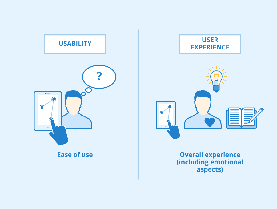
UX or user experience describes the quality of an individual’s experience with a product or service. Good user experiences are those that help you complete your tasks and goals quickly, with little difficulty or confusion, and UX designers are trying their best to design it this way.

Think about the process of purchasing movie tickets. You could enter the name of your neighborhood movie theater into Google to find its website, click it, and then use the search bar to see what movies are playing there. When you locate a movie you want to see, you proceed to the checkout to buy your tickets. You get your tickets via email once your purchase is complete. The user experience is comprised of all the various steps in that process.

You’ll have a positive user experience if the process is quick, clear, and simple to follow, with a logical path from point A to point B. You’ll have a poor user experience if it’s riddled with mistakes, missing data, slow load times, or unnecessarily difficult obstacles.

Why Is UX Important?

The importance of UX cannot be overstated. The distinction between a successful and failed product can ultimately be determined by the quality of the user experience.

Here are some things you need to think about: 66% of customers are willing to pay more for a great user experience, and businesses that improve the UX design of their websites can see conversion rates rise by as much as 400%.

In the end, happy customers who continue to favor a specific brand over its rivals are the result of positive user experiences. These satisfied, devoted clients generate income and sustain the brand. User experience must be a top (if not the top) priority because a product or service is only as good as the experience it offers.

That sums up user experience. What about SEO?

Why Does SEO Matter?

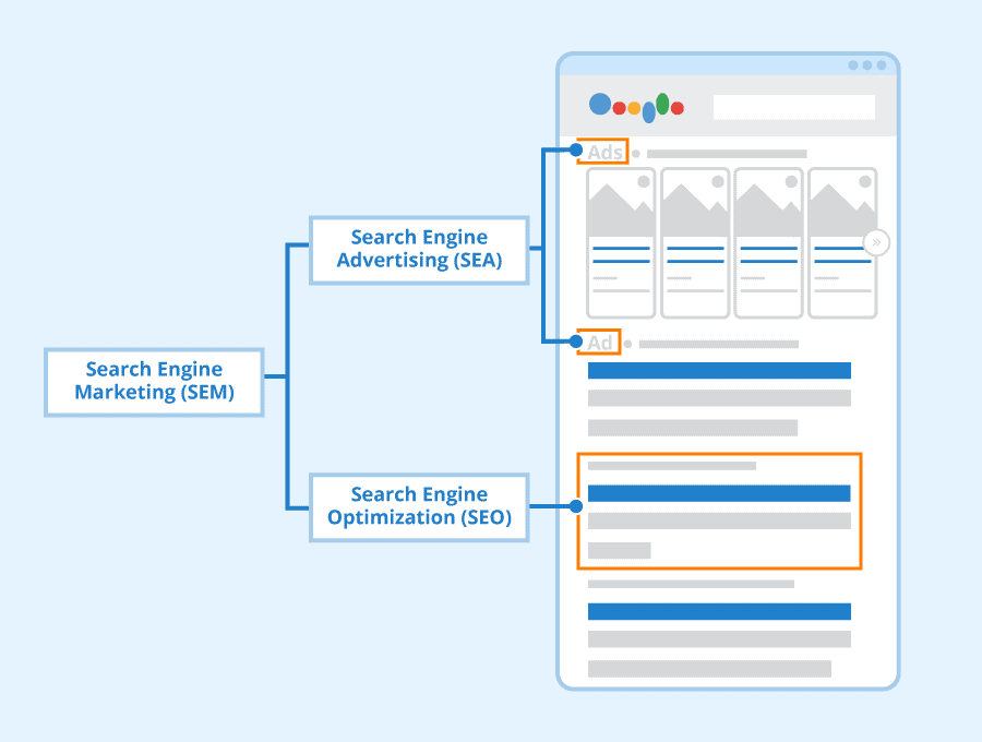
Search Engine Optimization or SEO is a marketing and technical discipline that aims to increase a website’s position in search results by bringing in organic (free) traffic.

Think about what happens when you do a Google search. When you enter a phrase into the search field, Google returns a list of websites that it considers to be pertinent to your inquiry. In addition, it ranks them according to quality and relevance, placing the best outcomes at the top.

You might notice a few results at the very top that have the word “Ad” next to them. The position on those websites was purchased. However, the results below them have ranked naturally—rather than as a result of direct payment, but rather as a result of their search engine optimization efforts.

Why Is SEO Important?

SEO is important because it makes your website and content visible to the right audiences.

While other marketing strategies require you to reach out to potential customers, SEO draws them to you. Your chances of showing up on the first page of search results increase with how well your website is optimized for search engines. Because they actively searched for what you’re offering on Google, the people who then click on your website are already interested in what you’re offering.

When someone visits your website and likes what they see, they are more likely to come back, share your content, and perhaps even make a purchase. So, if you want to develop your brand and turn readers and visitors into customers, SEO is essential.

Now, let’s think about how UX and SEO work together and why it matters.

How Does SEO and UX Affect Each Other?

Creating a user-friendly website that provide users with the information they seek is the common goal of both SEO and UX.

Search engine algorithms take into account more than just technical factors when determining the credibility of a website. They also observe user behavior on the website to gauge the quality of the user experience it offers. A website will fall out of favor very quickly if the algorithms discover that users tend to leave a given website shortly after arriving there. It will drop in the rankings to make room for rivals who seem to be offering a better user experience.

Consider how frequently you’ve performed a Google search, clicked on the first or second result, and then realized moments later that the information was actually unrelated. Or perhaps the information is pertinent, but the constant barrage of pop-up advertisements that clutter your screen is off-putting. What about those occasions when you use your phone to access a website and discover that the design is haphazard or that the page won’t even load?

You will click the “back” button in each of these situations faster than you can say “bad UX.” Additionally, each of these situations is detrimental to the website’s SEO ranking.

Keep visitors on your website if you want to maintain a high ranking in the search results. Additionally, you must offer a positive user experience if you want visitors to stay on your website.

In light of this, the following are some of the key UX elements that will affect a website’s position in search engine results.

UX Factors That Impact SEO

There are elements that guarantee a positive user experience which also favorably affects the SEO of your website. If you want your website to succeed in both UX and SEO, pay close attention to the following five design elements.

Page Loading Speed

The user experience is terrible and SEO suffers on websites that take forever to load. You don’t need to be an expert in user experience to understand that slow-loading pages are incredibly annoying from a user perspective. Page speed is a proven ranking factor for Google.

So, what can you do to make your website load faster? You can stick to best practices. Some of them are design-related, such as lazy loading, a design strategy that only renders certain objects when they are absolutely necessary (for instance, only loading below-the-fold images as soon as the user begins to scroll). Others, like image optimization and CSS, JavaScript, and HTML code minification, are more technical and may call for a developer’s assistance.

Responsive Design

Regardless of the device they use to access your website, people expect a seamless experience. Although responsive design is not confirmed as a ranking factor, it is overtly endorsed by Google. Of course, this ensures a positive and consistent user experience across all devices.

When building and optimizing your website, responsive design should be a top priority because more than 60% of website traffic comes from mobile devices.

Website Copy

When it directs visitors to your website, Google wants to know that they can find the information they are looking for. It will examine a variety of factors, including how long they stay on your website (or how quickly they leave). Copy is a key component of the user experience that can affect how long a user stays on your site and, in turn, your website’s SEO.

Copy is one of the most effective tools for directing website visitors to the information they need and guiding them through your website. Website copy directs users in the right direction without making them look too far or think too hard, much like the road signs that direct drivers.

Users will find what they’re looking for more quickly and stay on your site longer if your website copy is strong. That’s a huge victory for SEO.

Layout and Navigation

IMG_1

Similar to this, the overall navigation and layout of your website should be created in a way that makes it as simple as possible for the user to get around.

Your website’s structure serves two purposes. On the UX side, it should give users an easy path to follow as they navigate your site. In terms of SEO, it offers a guide for search engines, outlining all the content on your site and how it is connected.

Prioritize the user when designing the structure and navigation of websites. Create pathways that are simple to follow and clear to navigate by erring on the side of simplicity and clarity. The design of individual pages follows the same rules. Utilize menus, headers, and CTAs to logically and visibly arrange your content.

If users can easily navigate your website, you’re doing more than just checking the usability box because it will also help boost your SEO too.

UI Design

Last but not least, make sure that the UI design of your website is optimized to leave a good first impression.

Google doesn’t evaluate a website’s visual appeal, of course, but human users do, and they do it quickly. Many visitors won’t stay to see what’s hidden if your website is an abomination to behold. They’ll click away in search of a website with better visual appeal. This translates to a high bounce rate for Google, which will unavoidably have an impact on your ranking.

Designing a user interface (UI) for a website entails more than just making sure it looks good. All of the UI’s guiding principles and rules are intended to facilitate the user journey that the UX designer has mapped out while delivering a consistent brand experience. In spite of the fact that UX and UI are two distinct concepts, they work very well together and cannot exist separately.

In Conclusion

Google takes into account a variety of factors when assessing and rating your website. It also considers user behavior, gathering information on how long visitors typically stay on your website and how they engage with it.

These user-related metrics are a reliable predictor of your website’s quality for Google, which in turn determines where it should rank in the search results. It’s straightforward: improve user experience, and you’ll improve SEO both directly and indirectly.

The post UX Elements That Impact Website Ranking appeared first on Creativ Digital.


from Creativ Digital https://ift.tt/PTfgCWI

Tuesday, February 21, 2023

Will AI Be Replacing UX Designers?

Many people believe that AI technology has entered the mainstream and they claim that the use of artificial intelligence is on the rise.

Whether or not that is the case, there is no denying that AI implementation is growing quickly and that it offers a variety of benefits and opportunities. It is predicted that by 2035, AI technology will increase corporate profitability by 38%.

While that’s great for business, how does it affect the people who work in those industries? What does it mean for professionals working in the design sector, specifically? Will UX designers be replaced by AI?

Let’s consider the future of UX designers in this blog.

 What is AI?

Artificial intelligence (AI) describes computer programs and devices that have been “trained” to resemble human intelligence. Simply put, AI trains computers to process massive amounts of data, identify patterns within the data, and take appropriate actions as a result.

Tasks that were traditionally done by people are now automated by AI. An everyday example of AI in action is the growing use of chatbots to comprehend and respond to customer inquiries.

Additionally, artificial intelligence is applied to improve current goods and technologies. Recall how Apple expanded their product line in 2011 by including the AI-powered digital assistant Siri? Another excellent example is Netflix, which uses algorithms to recommend TV shows you might enjoy based on your prior viewing history.

Now let’s ask whether AI will replace UX designers.

Will AI be Replacing UX Designers?

PwC predicts that by the middle of the 2030s, up to 30% of jobs could be automated based on their analysis of more than 200,000 positions across 29 nations.

The employment outlook for people, however, isn’t as dire as it seems. The World Economic Forum estimates that by 2025, AI will both replace some human jobs and generate 97 million new ones.

The degree to which automation varies by industry must also be noted. Jobs that depend on social skills and the so-called “human touch” won’t be as easily replaced by AI, despite the fact that sectors like finance, transportation, and logistics are likely to be severely impacted.

What will happen to UX designers?

There is a general belief that AI will neither eliminate the need for UX design nor will it take the place of human UX designers.

There is no doubt that one of the most human-centric professions is UX design. To connect with your target audience and comprehend the issues they are looking to you to solve, empathy is a necessity. UX design needs a profound comprehension of human psychology and the factors that influence how people behave when using goods and services. Naturally, it also heavily depends on cooperation between various human stakeholders.

It’s difficult to picture a scenario in which artificial intelligence could take the place of all that “humanness.” In the end, creating experiences for people needs a human touch. Right now, only humans are able to do that.

That is not to say that AI doesn’t have a place in the world of UX design. Designers have a lot of potential with AI, and it will undoubtedly change how they do their work in the future.

Let’s think about how AI can help UX designers create exceptional user experiences in light of this.

ux-indonesia-pqzRfBhd9r0-unsplash

How to Use AI in Design to Create Better UX

The livelihood of a UX designer is not threatened by AI. Instead, it is a powerful tool that UX designers can use to produce top notch user experiences.

UX can benefit from AI by:

  • Enabling the collection and analysis of massive amounts of user data
  • Allowing more accurate personalization
  • Delivering better customer service to users
  • Automating some steps in the creation process
  • Assisting in closing the accessibility gap on the web

Let’s take a closer look at these possibilities.

Large volumes of user data are easier to collect and analyze thanks to AI

Analytics and data are crucial to the UX design process. The more data you can gather and analyze, the more in-depth your insights will be; whether you’re collecting data as part of your initial user research, conducting A/B tests to determine which version of a design performs best, or analyzing behavioral data to see how your product performs in usability testing.

UX designers will ultimately have a better understanding of what users want and need thanks to AI’s ease of handling large amounts of data.

AI Makes Personalization More Precise

In UX, personalization means giving the user content that is specifically catered to their needs and interests. It customizes the product interface based on who is accessing it using behavioral data and machine learning, a branch of artificial intelligence. This guarantees that the most pertinent information is presented to each individual user. Personalization is thus a potent tool for enhancing user experience and connecting with your target audience.

Better Customer Support Through AI

Many products and services require prompt and efficient customer support in order to provide a positive user experience. For instance, if you’re designing a banking app or an e-commerce website, you want your users to be able to resolve any issues quickly and effectively. The design of customer support into your product using AI is made possible by chatbots, which improve the user experience.

AI-Powered Design Tools Increase Productivity

Although there is currently no threat that AI will replace UX designers, it can be useful in automating some steps in the design process. There are many programs on the market that use AI; in fact, while using some of the most well-liked UX design tools, you may have used AI without realizing it.

Tools like Uizard, an AI-powered prototyping tool, and Khroma and Colormind, which automate the process of creating color palettes. Adobe Sensei is an AI tool that integrates with Adobe software. AI can be useful when it comes to some of the more routine tasks, but UX designers will always need to rely on their own special abilities and creativity.

AI Can Help in Bridging the Accessibility Gap on the Web

One of the guiding principles of UX design is accessibility. Making sure a good or service is accessible to as many people as possible—especially those with disabilities—is the goal. The web accessibility gap is a result of the fact that less than 2% of all websites complies with accessibility standards.

Niv Penso explains in a Forbes article how using AI can significantly increase accessibility:

“AI-powered solutions now make it possible for website owners to make their sites accessible without having to alter their source code. The automatic nature of the process presents a scalable solution to the web accessibility gap. Now, remediation processes can be done on a global scale, to millions of websites and with automatic, ongoing maintenance. More importantly, it can make a huge difference in the lives of millions of people with disabilities worldwide.”

In Conclusion

Reading about the rapid development of AI and the effects it is expected to have in the not-too-distant future can be unsettling. But hopefully this article has allayed some of your concerns about how AI might change the role of the UX designer.

Currently, there is a very slim chance that AI will eliminate the need for UX designers. In the end, UX is overly dependent on the “human touch”; when it comes to creating user-friendly products, empathy will always come first. Although AI will play a bigger part in UX design, we see this as an opportunity rather than a threat. So don’t let AI stop you from pursuing a career as a UX designer. The use of human designers is still prevalent.

The post Will AI Be Replacing UX Designers? appeared first on Creativ Digital.


from Creativ Digital https://ift.tt/TX7W8Oq

Monday, February 20, 2023

Content Creation Tips to Boost Sales Via LinkedIn

LinkedIn is one of the most popular social media platforms in the world. It’s also a great place to build your business and grow your audience. However, there are some things you can do on LinkedIn that will help boost your sales as well as keep customers coming back for more.

The Importance of LinkedIn to Your Business

LinkedIn is one of the most powerful business tools out there today. It’s a great place to find jobs, connect with colleagues and build relationships–and it’s an ideal place for you to share content.

Approximately 134.5 million users actively use LinkedIn each day, making it the world’s largest professional social network by number of users. That said, LinkedIn isn’t just for professionals; anyone can join and use it as a platform for finding new business opportunities or connecting with their peers from other industries or backgrounds.

This is enough reason to join LinkedIn. If you’re already using the platform, here are some tips to boost your sales via LinkedIn.

Choose the Best Time to Post

Do you have any idea of the times and purposes at which your target audience uses LinkedIn? You can prevent some of the more frequent scheduling errors by better understanding their schedule and motivations and posting at the precise time when you can succeed.

Examine the relevant elements for your market, target demographic, region, and, of course, your sales objectives. Remember that LinkedIn material should not be used solely to promote sales but rather to foster relationships and establish trust.

Choose the ideal time to post on LinkedIn based on the preferences of your target audience and the particular campaign goals. Keep tabs on the effectiveness of your campaign to adjust the publishing times for greater organic reach.

Always Provide Value

While your LinkedIn material will differ, you need to examine how effectively it fits into your sales funnel. Does your content benefit your potential customers? Ideally, you can use LinkedIn to provide sales enablement content that will aid in properly positioning your brand and demonstrating how your good or service is superior to that of your rivals.

Speak with your sales staff; while they may not be in control of content development, they can provide your social media team with information on the kinds of inquiries they receive from prospects and the information that helps them complete more deals. You should use that information in your LinkedIn posting.

Learn From Competitors

There is already a ton of content on LinkedIn vying for your audience’s attention. You can see how important it is to change your content strategy frequently when you consider the fact that some industries are more crowded than others.

For instance, everything is an app these days. Everything from simple communication to e-commerce, exercise, and money management now has its own app. Seeing that the top app marketing companies use LinkedIn extensively to reach as many individuals as possible.

If your market is similarly competitive, why not take business lessons from the leaders? See if you can create compelling content that will help you increase consumer trust, attention, engagement, and eventually sales by seeing how your competitors interact with their audience

cropped-viral_main

You Can’t Go Wrong with Video

You will be far more likely to produce high-quality leads from social networks like LinkedIn if you can position yourself and your business as a thought leader, innovator, and authority in your field.

So, utilizing video content is one of the greatest strategies to reach this objective. If you want to stand out and leverage your content production to provide value, it’s no longer simply a choice; it’s a requirement.

  • Create educational podcasts on relevant subjects.
  • Interview industry experts, the specialists you collaborate with, and other C-level executives who have insightful things to say. Use a straightforward interview tool to capture and organize the content, and then either publish the entire thing or just the parts you want people to pay attention to.
  • Make compelling demos. Demos are a crucial sales tool, but they’re also a fantastic chance to share content on social media that will pique the interest of your target audience.

Monitor and Leverage Visibility

This step is especially important for managing your reputation as well as for allowing others to express their opinions about your company. Such content can gain more traction because it increases your visibility and increases the likelihood that people will associate you with success or excellence.

Once more, LinkedIn presents a priceless opportunity for SaaS businesses. With so many rivals, getting your name listed among the best SaaS providers and having someone else recommend your brand will quickly boost your reputation and drive up your sales.

To reap the benefits, however, you must keep an eye on all brand mentions on LinkedIn, reply to reviews, interact with your community, and secure a place on such a list.

Optimize Content

It cannot be emphasized enough how crucial it is to produce LinkedIn content that is relevant and helpful to your target audience. It is equally crucial to optimize your content by utilizing a variety of keywords and phrases related to your industry.

One of the most crucial content promotion strategies to increase the visibility of your content is optimization. It makes you more accessible to more people, especially those who are unfamiliar with your brand.

With the right content, potential customers will learn the most pertinent information about your company from your page and follow you in order to see more of that type of content, rather than simply coming across your business page on LinkedIn and leaving without knowing what you do.

The only acceptable method of using LinkedIn to attract new clients and cultivate repeat business is by publishing helpful content. Finally, if your content gains traction, which means you receive comments in addition to shares, reactions, and likes, make sure to thank those who have commented.

ecommerce web designer

Analyze, Improve and Repeat

Your LinkedIn content can support your sales objectives, but it can also act as a testing ground where you can discover what your audience finds most engaging.

Which posts generated the most leads for your LinkedIn inbox or increased traffic to your website? What articles have generated the most interaction, shares, and visibility?

The foundation for enhancing all upcoming campaigns should be understanding the performance data of each campaign. Your LinkedIn content strategy will be greatly improved by the data you collect, map, analyze, and use in other ways.

By understanding your audience’s behavior on LinkedIn, you can get to know them. Determine how your brand fits into their lives and what you can do with your content to attract more customers or at the very least increase your social media following. Your ability to improve your strategy and the caliber of your LinkedIn content as well as its impact on your target audience will be facilitated by the more you learn from your data.

Go for Automation

You can tell from what you’ve read so far that the majority of suggestions take a lot of time, creativity, and trial and error. Some social media management tasks, however, can and ought to be automated. For scheduling, creation, and analytics, the best social media software, that can help you save time, cut costs, and most importantly, reduce errors.

You no longer need to manually publish each post, monitor its effectiveness, or look for brand mentions thanks to automation. Instead, you can prepare your content well in advance, plan your posts, and let your software handle the rest while you concentrate on corresponding with new leads to increase sales.

Automation probably makes it easier for you to interact with potential customers one-on-one because it gives you more time to manage your sales pipeline. In that sense, automating a particular part of your LinkedIn content strategy will have a big impact on your capacity to bring in more clients and meet your sales targets.

Final Thoughts

If you know how to leverage your brand presence, network, and hone your communication with your target audience over time, LinkedIn can be a powerful sales ally for your company. You can support your sales team by monitoring content performance carefully and modifying your output accordingly, but don’t narrow your attention to just the sales figures.

Your main goal on LinkedIn should be to establish your brand, raise your profile, and provide lots of opportunities for interaction with your target market. If you do this, your sales will undoubtedly increase.

The post Content Creation Tips to Boost Sales Via LinkedIn appeared first on Creativ Digital.


from Creativ Digital https://ift.tt/dJ6FxyW

Sunday, February 19, 2023

Different Ways to Use Customer Feedback

Your customers are your most important asset. They’re the ones who make you successful, and they can often tell you exactly what needs to change. That’s why it’s so important to listen to them and set up a customer feedback channel.

Here are some of the ways that you can use customer feedback in your business:

Boost Customer Experience

Which features of your product or service are effective may be revealed by customer feedback. You can also identify problems with your company’s workflows for producing products, providing customer service, or other areas.

You can make the necessary adjustments to enhance your customer experience once you have the customer feedback. Customer retention depends on providing a positive customer experience. Every enhancement you make to the client experience will increase client loyalty to your brand.

This is how the most prosperous businesses make use of customer feedback. Apple, for example, has remained competitive for such a long time because it prioritizes product feedback.

Use this feedback in conjunction with pertinent customer experience metrics to assess your performance.

Always keep an eye on how your efforts are doing. For instance, data from your analytics platform can show how the changes you are making affect your customer base. Your customer relationship management platform is one more potential source of data.

Make changes to your strategy based on the data you collect. If your efforts have a positive result, keep up the good work.

Turn Customers into Brand Advocates

Customers who are satisfied with your brand are more likely to recommend and advertise your company. They will use a variety of channels to spread the word about their positive experience.

Referrals from word-of-mouth are effective. Because of the high caliber of the goods or services you offer, it demonstrates that your clients have faith in your brand. So, if you notice individuals who consistently give positive feedback about your business, get in touch with them and make them promoters.

There are numerous methods for doing this. To entice them to continue using your brand, you might, for example, give them a thank-you gift. In addition, you might give out special benefits and rewards like freebies or commissions for bringing in new clients.

Use as Social Proof

Customer reviews can be used as social proof. Rosie Murphy’s research indicates that 91% of consumers regularly read online reviews. In addition, 84% of respondents think blog posts are just as reliable as recommendations from friends or family.

Simply having social proof increases a company’s credibility because it comes from customers, and since traditional advertising has lost its authority, customers’ opinions often have more weight than company-branded messages.

happy-customer

You can showcase the high caliber of service you offer your clients by including testimonials on your website. You can be more persuasive by citing social proof from well-known companies or industry influencers.

If you look closely, you will see that product reviews take up a significant portion of the Amazon product page. As consumers have become more dependent on self-guided research, they are relying more and more on the opinions and experiences of other customers in reviews when making purchasing decisions. Make those simple for them to access.

Improve Sales & Marketing Materials

Have you ever noticed that when you are around a group of people, your speech or behavior changes?

Most of us unconsciously imitate others in social or professional contexts, including their speech patterns and body language. We do it because it makes us more sociable.

Your target audience must relate to the messages in your sales and marketing materials. Successful copywriters will make an effort to tailor their content to the intended audience. That entails employing language that your audience would be familiar with. Because of this, many brands that cater to consumers write copy that is more casually styled, whereas brands that cater to businesses usually write more formally.

Utilizing the data is yet another way you can use client feedback to enhance your copy.

Develop a Wider Product Range

Additionally, you can use customer feedback to broaden your product selection. For instance, if one of your products does well and receives positive feedback, you might want to branch out into that market and sell additional products that are related to it.

Ask your customers what products they would like to see you sell again before extending your product line. Your starting point is simply the existing customer feedback. You should gather as much information as you can before taking a risk like expanding your product line because doing so is a business risk.

customer relation

Sending customer surveys is one way to collect data. Interviews and data analysis of your company’s data gathered from a CRM or other sources are two additional data collection techniques.

Create a New Business

Utilizing customer feedback, you can change your business’s focus or launch it in a different market. At every step of the decision-making process, you can advance your business and ensure its success by paying attention to and taking into account the feedback from your customers.

For instance, if you manufacture hairbrushes and discover through customer feedback that customers would adore it if you sold pet combs, you can conduct research on that completely unrelated niche. Start making plans for how you can enter that market if the data suggests doing so could be profitable.

You have all the information you require thanks to customer feedback. Make use of it to your benefit.

Final Thoughts

Customer feedback can provide you with information that you can use to guarantee the success of your company. All you need to know is how to maximize it.

You discovered six uses for customer feedback. Utilize it as social proof, to enhance the customer experience, and to convert pleased clients into brand promoters. Additionally, you can use customer feedback to broaden your product line or find new business ventures. If you know how to listen to your customers and use that feedback, you can increase customer retention and average customer lifetime value. Any business that wants to scale its operations should consider this.

The post <strong>Different Ways to Use Customer Feedback</strong> appeared first on Creativ Digital.


from Creativ Digital https://ift.tt/QI0YTws

Thursday, February 16, 2023

Tips for Identifying Which Social Media Platform is Best for Your Small Business

Social media is a great way for small businesses to build their brand, but it can also be overwhelming. How do you know which platforms are right for your company? And what platform should you focus on first? This post will answer those questions and more by giving you advice on how to identify which social media channels might work best with your business goals.

Different social media channels for businesses

Social media is a great way to engage with your audience, share content and build your brand. It’s also an excellent way to find new customers and employees.

Social media channels are different for every business, so it’s important that you pick the right one for your company.

The top three

The top three platforms for business-to-consumer (B2C) brands are Facebook, YouTube, and WhatsApp. These channels provide a range of features that can help you reach customers in new ways. For example:

  • Facebook allows you to create an account for free if your brand isn’t already verified on the site. Signing up will also give you access to insights about how people interact with your page as well as tools like Page Insights and Audiences Insights that help analyze what content resonates best with users and identify opportunities for optimization.
  • YouTube is one of the most popular video sharing sites in the world today–it has over 1 billion users who watch more than 2 billion hours of content each month. You can create engaging videos using this platform by uploading them directly from your computer or phone or through its mobile app (which makes it easy for anyone who wants access). You can then promote these videos through paid advertising campaigns so they’re seen by even more people across all platforms including Facebook owned Instagram which has been particularly successful at driving engagement among younger demographics – between 25-34 years old.
  • The commercial benefit of WhatsApp is customer communication. According to recent data, 54% of users choose WhatsApp to track purchase and delivery updates, followed by 50% of users’ preference for appointments, webinars, and event alerts, and 39% of users prefer WhatsApp as a channel for customer care.

Companies may advertise their goods and services, communicate with customers directly, and reach a large audience by utilizing one or all three of these well-known social media platforms.

LinkedIn

LinkedIn is a great place to find new customers and connect with potential clients. It’s not just for professionals, either; you can use it as a platform to share content, build your brand and network with other companies.

The social media platform is also an extremely useful tool if you’re looking at hiring someone else who knows what they’re doing–LinkedIn has over 300 million members worldwide who have experience in their industry.

Social media icons

Twitter

Twitter is a great place to share your expertise, content, news and events. It’s also an excellent way to interact with customers and the community.

Here are some tips for using Twitter:

  • Share content relevant to your audience on Twitter. Make sure that whatever it is that you’re sharing has something interesting about it–it can be a new product or service announcement, an article written by someone else in the industry (with links back up), even just some interesting facts about how social media works today. If people like what they see then they may start following you.
  • Use hashtag searches to find hashtags related to topics related to what interests people most at any given time; these could be anything from #veganuary (for those who want their diet restricted) through #selfieadvice (about taking better selfies) right up until trending hashtags such as #thisisthesolution

TikTok

TikTok is a popular social media platform for people who love to share videos. It is one of the most intuitive platforms to use and has a large audience, so if you’re looking for an opportunity to grow your audience with short-form content, TikTok could be the right fit for you.

Pinterest

If you’re not familiar with Pinterest, it’s a visual platform that allows users to share images and pin them on boards. Users can then follow those boards as well as other people’s pins.

You should use this social media channel because it allows you to showcase your brand personality and style. You can also promote your business or blog through Pinterest by posting relevant article titles and descriptions, which will help generate traffic from interested people who want more information about what you do.

If you have an interest in a certain niche (like fitness or fashion), then using Pinterest is one of the best ways for small businesses like yours to reach out directly into their target audience without having any friction between them–and without spending too much time advertising.

Which Social Media Platforms are Best For Your Business?

Once you have a clear idea of what your business does, who its target audience is and what kind of content it can create, it’s time to determine which social media channels are best for your small business.

Here’s how:

  • Consider the purpose of each social platform. For example, Pinterest is great for sharing visual content that isn’t text heavy like blog posts or news stories; Instagram has become a popular format for photo sharing; Vine allows users to share short videos with their followers through a series of looping clips (think GIFs); Twitter allows users to post 140 characters at once–perfect if you’re trying to get something out there quickly while still having enough room on screen so people don’t miss anything.
  • Consider the demographics of those platforms. For example: If one person owns an online store selling women’s clothing online then he might want more followers than someone who runs an accounting firm but doesn’t have any products listed on his website yet. You could even make sure not just men but also women follow these social media accounts too–another way would be creating multiple accounts across different brands/products so no one feels left out when it comes time for promotions.

Identify Target Audience

To identify the right social media channels for your small business, you need to know who your target audience is. This isn’t as easy as it sounds. Once you have a clear idea of what they like, how they feel about something and why they engage with certain content over others, it’s easier to determine which channels work best for them.

Here are some questions that can help you answer this:

  • Who are my customers?
  • What do they like?
  • What are their interests?
  • What are their pain points?
  • How can I help them meet their needs more effectively through social media?

What’s Your Budget For Each Platform?

The next thing to consider is your resources. What are you willing to invest in?

For example, if you have limited time and money, it might be better for you to choose a social media platform that has fewer users than another one but offers more benefits (such as analytics). Or perhaps you’re starting from scratch and don’t have any experience with social media marketing at all–in which case, it could be better for your business if there were many more users on the platform so that people would find their posts more easily. The point here is that each of these factors matters differently depending on what stage of growth your small business finds itself in at this particular moment in time.

It’s also worth remembering that not everything can be measured: some things are subjective or qualitative (like how much value someone gets out of using a certain feature), while others are quantitative (how many times did they visit my website last month?).

Social Media Sphere

Do You Have Time to Create Content?

Can you create content effectively?

The answer to this question depends on what kind of business you’re trying to build. If you’re selling products or services, then yes, it’s important that your audience knows what they need and why they should buy from you instead of another brand. That’s why many businesses invest in social media training courses–because they want their customers (and potential customers) to know exactly how much value they’re getting out of using their products or services. But if all your customers do is buy stuff from you–and never engage with your brand again–then maybe it doesn’t matter how great your marketing strategy is.

How Many Platforms Do You Need?

How many social media channels should you be using? There is no one answer. It depends on your business, resources and audience. For example, if you’re a small business that doesn’t have the money or time to manage multiple platforms and audiences then it makes sense to focus on just one or two platforms. If however, you’re already managing multiple accounts (Facebook page + Instagram account) then there is room for more–but only if they are used strategically in conjunction with each other.

If this sounds confusing don’t worry because we’ve got some tips for getting started.

How Will You Use Each Platform?

When you’re thinking about which social media channels to prioritize for your small business, it’s important to understand the purpose of each platform. What is its primary benefit? Does it offer an audience that will help you grow your business or generate revenue in some way?

The first question should be: what is this platform used for? Do people use this platform because they want information about my product or service (i.e., Facebook), or do they use it just because they want something interesting to read (i.e., Twitter)? This question should lead you down a rabbit hole of research on your competitors’ websites and blog posts until you have a pretty good idea of how much traffic each platform produces per month/year/etcetera — then factor those numbers into your decision-making process.

Bottom Line

Social media is a great way to connect with your customers, build brand awareness and grow your business. However, it’s not always easy to know which social media platforms are best for your small business. In this article we’ll explore the various types of social media channels, how they work and what makes them unique so that you can decide which ones are right for your company.

The post <strong>Tips for Identifying Which Social Media Platform is Best for Your Small Business</strong> appeared first on Creativ Digital.


from Creativ Digital https://ift.tt/c0hqxNC

Wednesday, February 15, 2023

Best Customer Retention Strategies for Small Businesses

E-commerce is a difficult business. As a result, many small businesses struggle to survive. To ensure that your business has a chance to succeed, you need to focus on customer retention. This means providing the best possible service so that your customers stay with you and refer their friends.

From product cross-selling to clear customer retention analytics, build a loyal customer base there are many ways to do this. Let’s take a look at five customer retention strategies that are important for small businesses.

Welcome Customer Complaints

The last thing small businesses want is for one of their customers to walk away unhappy. The importance of customer retention is the process of keeping customers from leaving your business and switching to competitors.

Here are some tips for doing so.

  • Always pay attention to customer complaints.
  • Respond to customer complaints in time.
  • Please stay open on weekends and holidays.
  • Keep your store open longer than your competitors.
  • Offer freebies.

Understand Your Customer’s Value

Want to know how to improve customer retention? The best way to retain customers is to understand the value they bring to your business. First, you should ask yourself what value your customers bring to your company. Then you can figure out how to add more value to them. Offer discounts, offer free services, create loyalty programs, and more. The more value you offer your customers, the more likely they are to stay. You should also make sure the business is easy to use and has many promotions and offers. This will give your customers the incentive they need to keep coming back to you.

Promote After-Sales

A great way to increase customer loyalty is to promote aftersales as part of your customer retention strategy. After-sales refers to the service and support provided by a company after the purchase of a product. Businesses that want to retain customers must create programs that provide products, services, and information to care for the products they just purchased. This helps keep customers coming back and also helps make them feel confident about their purchase.

Practice Green Principles

Businesses need to care about the environment, so companies are implementing environmental strategies to retain their customers. A recent survey found that 66% of consumers would buy from a company with a green mission statement. Recognizing customer needs and having environmental protection principles as part of business strategy is critical.

Consumers are becoming more environmentally conscious and appreciate the products they purchase. They want to know that the companies they buy from are trustworthy and sustainable. There are many ways to become a responsible company, one of which is using green principles as a customer retention strategy.

The key to green principles in increasing customer retention is providing products or services that are better for the environment. This means that the product or service is recyclable, biodegradable, or environmentally friendly. It also means offering products with a low environmental impact.

Another way to pursue green principles as a customer retention strategy is to have a company that cares about the people who make their products. We can demonstrate this by offering fair wages and benefits, providing a quality work environment, and being transparent with our customers.

Make a Customer Calendar

A customer calendar is a great way to keep track of your customers and their needs. You can do this by creating a monthly calendar that shows the dates of important events and milestones for your client. Use customer loyalty software for these needs, or simply set a date in your Google calendar.

Customer calendars can also include dates important to your business, such as holidays and birthdays. This helps both the customer and the business as it helps the customer understand what is going on in the business and keeps them organized. Create customer calendars to remind your customers of special offers, events, and upcoming appointments. This can be done on social media, email or website.

Wrap-up

We hope that the above-mentioned strategies help you retain customers; because it costs significantly more to acquire new clients than it does to keep existing ones, customer retention is crucial. Additionally, returning consumers are more likely to participate in word-of-mouth advertising or serve as brand ambassadors.

The post Best Customer Retention Strategies for Small Businesses appeared first on Creativ Digital.


from Creativ Digital https://ift.tt/dj6Sqp8

Tuesday, February 14, 2023

Tips for Increasing Engagement Organically on Facebook

If you want to increase engagement on Facebook, there’s no need to pay for ads or rely on a third party. Organic reach on Facebook has been declining for years, but that doesn’t mean you can’t still reach your audience on the platform. In fact, there are many things you can do to reach more people and get them interested in your content. Just be smarter about it.

What is Facebook organic reach?

Reach is the number of people who see your post. It’s not the same as impressions, which is the number of times someone clicks on your ad or link.

Reach for a Facebook Page post includes all people who saw that specific piece of content regardless of whether they liked or commented on it; as well as those who were exposed to related content from other Pages they follow or friends’ posts they like/share but didn’t necessarily see.

Organic reach is determined by the algorithms Facebook uses to display content on the News Feed. The algorithm takes into account a variety of factors, including content type, time of day, frequency of posting, and audience interest.

If you’re unsatisfied with the level of engagement you’re currently receiving, there are a few things you can do to change that. Here are some tips on how you can do that.

Create content that reflects your brand ideals

Before thinking about how to increase engagement organically on Facebook, you must first ensure that you are posting content that aligns with your brand’s ideal audience. Creating content that aligns with your brand’s ideals is critical to a successful online business. By creating content that resonates with your target audience, you are more likely to attract and retain customers.

So ask yourself the following questions. What is my company brand and what type of content is my audience interested in?

Keep these tips in mind when creating your content:

  • Make sure your content is relevant. Your content should be tailored to your audience’s interests, and your posts should be relevant as well as interesting.
  • Keep it simple: Your content should be as simple and understandable as possible. This makes readers more likely to take action like sharing it on Facebook or other social media platforms.

Use video

credit: Instapage

And now a word about posting videos as a strategy to increase engagement. Facebook videos are he one of the most powerful mediums to engage an audience. Research shows that people are more likely to engage with a video if it is interesting and relevant. And Facebook videos are often shared more than any other type of content.

There are a few things to keep in mind when creating videos for Facebook. First, make sure it’s high quality. Then make sure your video is well edited and has catchy captions. Third, make sure your videos are interesting and relevant to your audience. Finally, make sure you can share your video.

Wondering what kind of video to post?

  • Post video testimonials from satisfied customers to provide social proof and attract new customers to try your product.
  • Try a short behind-the-scenes video of the brand. This makes it easier for your audience to identify you and increases engagement with your brand.
  • Use videos to showcase your products and services. Show them what you offer and why people should buy it.
  •  Share funny or interesting stories.

Mix Post Formats

If you feel stuck with Facebook engagement, try mixing up your post formats. Instead of posting pictures all the time, try posting videos or links to interesting articles. Or, instead of always posting about your business, try posting something personal or funny that will give your fans something to talk about.

You can also ask questions and run contests to get people to interact with your page.

A Facebook marketer said he posted two images he wanted to use as the featured image for his next blog post and asked viewers which one to choose. Viewers were happy to provide suggestions and participate in this content after its release. Mixing things up keeps the page fresh and interesting, and you might find that engagement levels start to rise.

Go Live on Facebook

Hosting a Facebook live is a great way to engage with your audience and promote your brand. You can use it to tell the story of your company, product or service in an interesting way.

You can also use it to promote an event that you’re planning on hosting, whether that’s an event for customers or staff members.

Activate Facebook Messenger

Facebook Messenger is a great tool for engaging your audience. You can also use it to send updates and announcements, as well as direct him messages about contests and polls. It’s also a great way to build a relationship with your audience and get to know them better.

To really get the most out of it, make sure you use the Messenger app regularly and reply to messages and comments. This shows that you care about what your audience has to say and makes them feel more comfortable engaging with you.

This is one of the strategies that can organically bring you more engagement than ever before. Also, your engagement on Facebook can become better than other social media platforms because you are always active on Messenger and interacting with my audience in real time.

Try Different Posting Times

We all know that engagement on Facebook is essential for your business. The higher the engagement, the more likely people are to see your post in their news feed. But what many people don’t realize is that when you post also matters. Experimenting with different posting times can organically increase your engagement on Facebook.

It’s easy to get overwhelmed with the daily management of your Facebook page. When you’re focused on creating good content, engaging with comments and messages, and perhaps running a few ads, it’s very easy to forget about the best time to post on Facebook.

For maximum engagement, post when your audience is on Facebook. This depends a lot on what the company offers. For example, if you find that your customers are most active in the evenings and on weekends, then try to do most of my posts during this time.

Do your own experiments to see what time works best for your audience.

Software-Development-Company

Be Short and Sweet

The average person only spends a few seconds looking at every post on Facebook. This means that if you want to increase engagement, you need to make sure your posts are short and engaging.

Keep your posts under 200 characters and keep them interesting and relevant to your target audience. Avoid posting long paragraphs or large blocks of text. Instead, focus on creating short, concise posts that are easy for your fans to read and digest. Studies also show that adding emojis to your posts adds “sweetness”, attracts attention, and increases engagement. Use this strategy for all your Facebook Marketplace listings and see how it works.

Bottom Line

If you want to grow your engagement organically on Facebook, choose one of these strategies and implement it today. After implementation, take time to analyze how well it works before trying the next one.

Consistent execution of these ideas and strategies will increase your Facebook engagement without digging a hole through your pocket. So what is holding you back? Pull up your sleeves up and start working. Your viewers are waiting!

The post <strong>Tips for Increasing Engagement Organically on Facebook</strong> appeared first on Creativ Digital.


from Creativ Digital https://ift.tt/o9Gm7Pn

Thursday, February 9, 2023

Guide to Increasing eCommerce Conversion Rates in Today’s Market

The eCommerce world is changing. It’s not just about offering your customers a place to shop, it’s about providing a seamless experience that keeps them coming back for more. This can be achieved through proper website layout and design, effective calls-to-action and product pages that convert visitors into buyers.

In this post we’ll explore these opportunities to increase conversion rates in today’s market.

Website Layout and Design

In order to have a successful ecommerce business, you will need to make sure that your website is easy for customers to navigate. The first thing that visitors do when they visit your site is look at the layout of it and decide whether or not they will buy from you.

Having a functional and efficient e-commerce website is essential if you want to compete in the commercial arena. However, an exceptional e-commerce website has some requirements.

A well-designed e-commerce website helps provide the best user experience for your visitors. But good design isn’t just about giving your e-commerce platform an aesthetically pleasing look. It also means making sure it’s quick, easy, and highly personalized. This reflects your brand and message and helps improve the customer’s user experience.

Calls-to-Action

A call to action (CTA) is the single most important element of your eCommerce conversion rate optimization. The purpose of a CTA is to guide customers toward taking an action that will lead to conversion, such as completing a purchase or signing up for an email list.

Where should you place your CTA? You want it on the screen where customers are most likely going to see it–whether that’s above other elements like product images, in between paragraphs of text or below advertisements.

A good rule of thumb: place CTAs at eye level so they’re easy for people who are standing or sitting at their computer screens. If you can’t get all readers’ eyes on one page at once because there aren’t enough pixels available, then consider breaking up each page into smaller sections so that each one has its own CTA button.

Product Pages

A product page is the most important thing on the entire website. It’s where you tell the customer what your product does, how it works and why they should buy it.

Product pages are also known as landing pages because they help you convert visitors into leads or sales by presenting your products in an inviting manner that makes people want to learn more about them. You can make this happen with a large number of elements, but there are four main components that every eCommerce website needs:

  • Product images – If a potential customer has no idea what they’re looking at when they land on your site, they’ll likely leave without buying anything or even taking their first step. This means making sure all of your products have high-quality photos so customers know exactly what they’re buying before opening their wallets.
  • Product description – The description should include all relevant details about why someone would want one of these items if there’s no need for one. It should also answer any questions that could come up during checkout if someone happens not know exactly how much something costs before being able to purchase one.

Shopping Carts

A shopping cart is a feature that allows you to store products in your online store and make them available to other customers. It’s important for eCommerce stores to create a well-designed, easy-to-navigate shopping cart so that consumers can buy from you without any hassle.

The most common way of doing this is by offering an itemized list of the items on offer with price details, as well as adding some sort of discount code or coupon code at checkout if possible (this will help increase conversions). The next step would be ensuring that each product page contains an “add to cart” button prominently displayed under its title bar–this should take care of most people who are interested in purchasing something but may not have made up their mind yet.

How a business website can maximize sales?

Checkout Process

The checkout process is a big part of your customer’s experience. It should be easy to follow, secure and fast.

Here are some things you can do to improve the process:

  • Make sure the checkout process is mobile friendly; this will ensure that visitors have an enjoyable time when they’re checking out on their devices or tablets.
  • Ensure that everything works smoothly and easily; this will help keep customers from getting frustrated with imperfections in the site or app interface.

Multiple Payment options

Accepting multiple payment options is an important part of increasing eCommerce conversion rates. Accepting credit cards is the most important payment method to accept, but you should also consider accepting debit cards and PayPal for your customers who want to pay with them.

Credit card processing fees should be as low as possible–this will make it easier for customers to use their preferred payment methods in order to pay you. If you can afford it, try offering discounts or coupons when a customer uses their preferred method of payment such as processing fees.

Security

There are a number of ways you can increase your eCommerce conversion rates by implementing security measures.

  • Use SSL certificates: If you’re using HTTPS and not using an SSL certificate, then your site is not protected from hackers who might be trying to access it. The best way to ensure this is by getting an SSL certificate from a reputable provider like GoDaddy, who will give you one for free if they feel that yours isn’t up to snuff this is known as “validation”. They also offer additional services like DNS management and website hosting which can help with other aspects of security on top of just providing the certificate itself.
  • Secure checkout process: You should make sure that all forms have fields requiring passwords or PIN numbers; if there isn’t one available at all times during checkout flow then someone could easily get into their account and spend money before they realize what has happened–and even worse–they won’t even know how much was taken until after it’s too late,

Bottom Line

The key to e-commerce success is increasing conversion rates. Retailers can improve the customer experience, encourage participation, and remove roadblocks in the sales process. And most importantly, you can grow your business. The retailer can also learn how customers interact with her website. This includes where they struggle and what they can optimize for by analyzing and improving their ecommerce conversion rates. We hope that these strategies can help improve conversion rates for your business.

The post Guide to Increasing eCommerce Conversion Rates in Today’s Market appeared first on Creativ Digital.


from Creativ Digital https://ift.tt/cAYOzek

Wednesday, February 8, 2023

The Relationship Between Web Design and SEO

Good website design is the key to good SEO. There are many factors that lead to high rankings on search engine result pages (SERPs), but one of the most important is design. In this post, I will discuss the relationship between website design and his SEO and how design can be used to improve his SEO.

Web Design is a Component of SEO

Web design and SEO go hand in hand, and more and more web designers are choosing to incorporate SEO when designing their websites. It is important for the business owner to be aware of the importance of her SEO in web design and the value SEO brings to the design process.

An SEO-friendly web design can attract more traffic. Your website may be attractive and attractive, but if it is not search engine friendly, you are limiting the ability of major search engines to access your content.

If your website’s content isn’t easily accessible to search engines, it won’t rank high in search results. To properly integrate SEO into your web design, you need aspects such as technique, navigation, links, and content.

How Web Design Affect SEO Rankings

Website design is one of the most important things for SEO. Think of it this way. You can create the best keyword-rich content in the world, but if your site is confusing or hard to navigate, no one will find it.

 Similarly, you can have a website that looks like it was designed in the 1990s, but as long as it’s easy to use and navigate, you’ll get traffic from people looking for your service. Bad web design practices will lower your SEO rank and lower your website’s search rankings.

So what’s the key? A great website design that looks great and is easy to use. Your website should be easy to find in search engines, and your layout should make it easy for people to browse your content. Pages should load quickly and all the information you need should be easy to find. 

The Importance of a Good Website Design

A good website design is important to your SEO efforts. Think of it this way. No one will take you as a business seriously if you have a website that looks like it was designed in the 1990s. And if people don’t take you seriously, they won’t want to do business with you.

Additionally, a well-designed website can help with your SEO efforts. Websites that are easy to navigate and look good rank higher on search engine results pages than those that are cluttered and difficult to navigate. So when it comes to websites, don’t skimp on design.

Investing in a professionally designed website that looks trustworthy and helps you rank higher in search engines costs money. A well-designed website can help make a good impression on potential customers. It also helps you nurture your leads and get more conversions.

Web Design Elements That Impacts SEO

The appearance of your website is an important part of your overall SEO strategy. When it comes to website design, there are a few things to keep in mind to optimize your website for Google and other search engines.

  • Page Title: One of the most important elements is the page title. This is a short phrase that appears in tabs at the top of your web browser. It’s also one of the first things Google looks at when determining his website’s ranking. Make sure it’s memorable and relevant to what you’re offering on the site.
  • Meta description: Another important element is the meta description. This is a blurb that appears below the page title on search engine results pages. It’s important to make sure it’s engaging and persuasive, as it can be a factor in deciding whether to click through to your site.
  • Layout and Design: The layout and design of your website can also have a big impact on your SEO. Make sure all your content is easy to find and your website has effective keywords. Google prioritizes websites that are well organized and easy to navigate.

Tips for Creating a Website That is SEO and User Friendly

Web_Design_Trends

Creating an SEO-friendly and user-friendly website design is difficult, but not impossible. In fact, following a few simple tips can make the process much easier.

One of the most important things to keep in mind is to make your website easy to navigate. Visitors should be able to find what they are looking for quickly and easily without searching through tons of pages and unnecessary her web elements. This is achieved by using clear, concise titles and easy-to-read fonts and colors.

Another thing to watch out for is website load times. If your page takes too long to load, your visitors are less likely to stay. You can improve the speed of your website by reducing the size of your images and optimizing your code.

Last but not least, you need to make sure your website is keyword rich. This means including keywords throughout your content, not just in titles and meta descriptions.

Tips for Designing an SEO Friendly Website

It’s important to keep SEO in mind when designing your website. Here are some tips for creating a website that not only looks great, but also ranks high in search results.

  • Use keywords in page titles and throughout your site.
  • Make sure your site is easy to navigate and uses clear and concise titles for your pages.
  • Include images and videos on your website, but make sure they are properly keyworded.
  • Avoid using Flash or excessive animations as they can confuse search engine crawlers.
  • Use useful and relevant metadata for your website pages.

By following these tips, you can create a website that looks great and ranks high in search results.

Web Design Do’s & Don’ts That Affect SEO

Do’s:

  • Make sure your website is responsive and looks good on all devices.
  • Use high-quality images and videos that load quickly.
  • Organize your website content in a way that is easy to read and understand. Use keyword-rich titles and descriptions for your pages and images.
  • Optimize your website for search engines. Write lengthy content on your website that provides value to your website users.

Don’ts:

  • Are you using too many Flash elements on your website? Flash is not supported by most search engines and can negatively impact your SEO.
  • Popups and ads can be distracting for users. Most importantly it leads to high bounce rates.
  • Make the site difficult to navigate. Users should be able to find what they are looking for in seconds.
  • Overload your website with too much text or information. Keep it simple and digestible.
  • Have unnecessary content that doesn’t do anything, or pages with little information. Search engines usually like pages with at least 500 words.

Bottom Line

Web designers now have access to more technology and options than ever before, showing just how advanced web design has become. Always put your users first when designing your website as it helps determine your SEO ranking. It is based on many technical aspects and the end user should always be a priority in the design process.  Web design is beneficial to businesses, clients, and search engines without being complicated or overwhelming. It should connect users to the links and content they need, while helping businesses reach more people.

The post The Relationship Between Web Design and SEO appeared first on Creativ Digital.


from Creativ Digital https://ift.tt/n0r5Lqh