All web designers are striving to create a user-friendly design and need to use their observation powers because this is the simplest way of achieving amazing UX (user experience). Creative ideas are good but observation is still one of the most critical assets of designers when developing a design based on UX.
A good design in not just about creativity, it is the result of a combination of multiple design elements that brings ideas and imagination to life.
In order to create a successful user experience, consider all the factors before making any design changes.
- Are the customers able to relate to your brand?
- Did they find what they were looking for?
- Is your portfolio a fit for the end-user?
- Are the features offered easily accessible?
Design Process of UX
Using this simple framework, you can anticipate the customer’s needs and design a solution accordingly.
Check out these principles that influence UX and can help you come up with a winning strategy.
Contextual Theme
The user should be able to access more information as they explore your platform, not less. For example, Facebook has a homepage that shows everything the user could possibly want.
Facebook introduced the Timeline feature in 2011 that displays a user’s complete history as a storyline. The platform now boasts a multi-billion user base. Your company’s website needs to be built up comprehensively, just like Facebook’s Timeline.
A unified theme in your site will be easy to navigate and may involve products, interesting stories, coloring or point objectives. You will gradually observe organic traffic coming in on a weekly basis with this system.
Familiarity

Your graphic designers and software can’t increase your traffic or sales. Many web designers and business invest heavily on graphics. However, traffic generation is still stagnant and sales are sluggish.
If you have been thinking if the effort is in the right direction, don’t worry. Having amazing design is very important and can lead to better conversion rates.
Implementing new frameworks and plugins can be costly but can make your website look better. However, good looks is of no use if the user does not click the buy button.
To keep up with the competition, Ebay has implemented various strategies that have allowed them to maintain their gross income and build a responsive site. They also have a country-specific product list so that people can buy what they need in their home country.
They also implemented responsive site design, secure payment gateways and category-based shopping. Using these strategies enabled the company to maintain its leadership amidst the thousands of e-commerce platforms.
Here are ways to deliver ominichanel design solutions. Omnichannel design will help make your customers more efficient, increase customer satisfaction and even increase your revenue with a single platform.
- Take note of the sticky details for every OS. Make sure that your product looks exactly alike from platform to platform.
- Presentation matters, even if it seems like you’re projecting a simple image. Customers may eventually find what they need and perceive your content as having value. Use familiar patterns and familiar style.
- To make sure your platform is compatible on all devices, test it thoroughly. With this hands-on experience and feedback from your users, you will be aware of their perception of the platform.
Focus on the Usability of the Core Offering
User Experience design is more than just designing an attractive website. It should be easy to browse through and to purchase from. Most sales are made on smartphones, so most people want a simple design that focuses more on their offerings.
To increase engagement with small screens, there should be fewer elements per page, prominent buttons and drop-down menus.
The link, button, or piece of information on any page should be worth prioritizing. There’s no point in adding anything unless it is going to be helpful to a visitor.
Here are some tips for making your platform even more user-friendly:
- Make your site easily readable so that customers will not be turned off by cluttered information on a single page.
- Stop using the auto refresh information more than necessary. It creates lags in a slow connection.
- If you want to focus all of your energies on a new product, make sure to hide features that aren’t as important, and remove it from the bottom of your priority list.
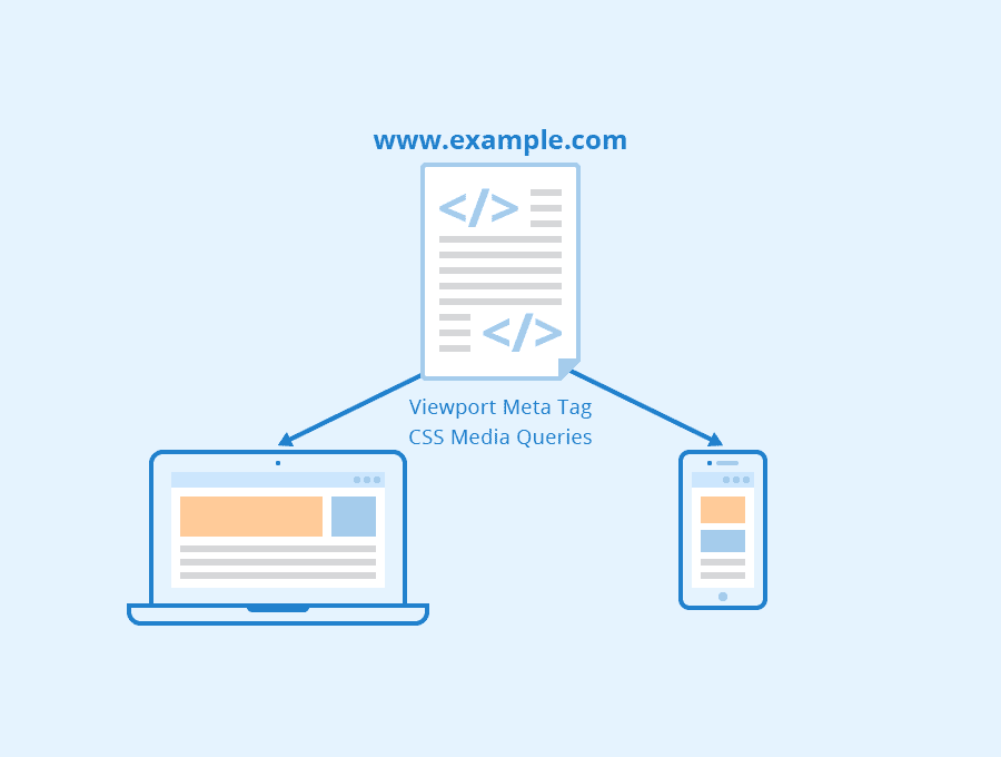
A good web design is the best way to keep your customers interested and coming back for more. This minimizes complexity, while emphasizing accessibility across platforms. Responsive web design lets users navigate on their own time and without any lag between screens.
The post 3 Basic Design Principles for Better UX appeared first on Creativ Digital.
from Creativ Digital https://ift.tt/ImzYceK
No comments:
Post a Comment