The website designer’s professional life revolves around crucial questions that may help to deliver better results for the client.
Essential widgets for conversion are what are important on a checkout page, and what elements you should include.
It is a common question as to whether a CTA button needs to be above or below the fold when building a Sales page.
Where should the CTA go? This question can make or break a client’s chances of making a sale. Unfortunately, this concern has been the source of a raging debate for many years now.
In this article, we’re going to talk about the benefits of placing a CTA above the fold.
When Is It Okay To Put CTA Above the Fold?
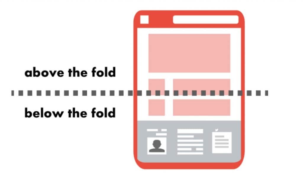
Website content seen at the top of a browser window is called “above the fold” and may change depending on device.
If you want to have the best results with a CTA, place it above the fold so that it is more visible. Specialists recommend this because not all screens are the same size and people may not scroll down.
When creating a page, your CTA should be visible and at the top of the page, not at the bottom. People are more likely to click on an offer that is above the fold, as opposed to scrolling down.
The NN Group, in collaboration with eye-tracking technology, found that pixels appear more often above the fold and design a website based on that.
There have been numerous studies on how important a call-to-action is at the top of the page. Top-of-the-page ads and CTAs proved to be significantly more visible than those located below the fold.
With stats like these, you might think it best to not use a bottom of the page CTA.

When Is It Okay To Put A CTA Below The Fold?
There is always an exception to the rule.
Yes, CTAs work best in the above-the-fold. But there are times when you want to be “out of the box”.
According to Google, the fold is below 60% of your screen. CTA’s below the fold are not guaranteed to be seen. If you want attention on an information-heavy page, allow your audience to scroll down and they may come across it.
Sometimes, you want an above-the-fold CTA to encourage them to download a product they know about. But if you’re trying to convince someone to sign up for your webinar, you might need to tell them what the webinar is all about first. That’s where a below-the-fold CTA comes in handy.
You should provide valuable, engaging content below the fold to maximize return and interest in your CTA- but customers are busy, so make it a priority.
The Fold Isn’t Everything in Web Design
The fold is often an essential consideration in web design.
One thing to be mindful of is where to place sign-up forms and valuable CTA buttons.
Place quality content at the top of your page, but don’t place your CTA there. What you do need to put above the fold is something that will engage a user and make them scroll.
What is above and below the fold does matter, but what you should worry about is how to get customers motivated.
Where to put a CTA?
It is important to consider your prospects’ motivation – will they want to click on the button? Would they find it desirable at that time? What does your visitor already know about the offer you’re making?
If you already have a relationship with your customer that they trust, then use an above the fold button. If you need to provide more information before they want the next step, then a “below the fold” CTA is more appropriate.
Above the fold should be exceptional. The closer a visitor is to converting, the more attention they’ll need to keep their attention.
The Truth About Designing for The Fold
Reality for web designers today is that if you want to increase conversion rates, it doesn’t really matter whether your CTA is above or below the fold.
The key to creating good infographics is to make sure that they provide all the information and have easy to click, easy-to-read buttons.
Different people come to websites for different reasons. Readers might be looking for information, reviews, or both when they visit. There are those that are:
- Already familiar about your brand and value you’re offering. They are people who are always clicking your landing pages from other marketing campaigns and know what your brand is about or is offering. You can give these prospects a CTA immediately so that they can continue down the buyer’s funnel as fast as possible.
- Uncertain about the features and benefits of your product. They need more information. These people may need a reassurance that the product is worth their time and hard earned money.
- Are new to your website: These users need a reasonable amount of information. They don’t know about your brand or why it’s valuable to them. Because of this, you may need to wait to push them into action until you’ve delivered the right copy.
It may be necessary to use multiple CTAs on one page. When people want technology that is new to them, they will want to click the button with the technology.
However, some visitors may not understand the benefits of real-time personalization. One liner answers are generally not enough in these cases.

How To Figure Out Where To Place CTA
There is no single rule to guide web design, so don’t feel too pressed to input an element “above the fold” despite what blogs say.
Even if a CTA button allows someone to download a free demo or sign-up for a newsletter, it still requires a customer to start a relationship with your brand.
Customers are more critical of business than ever. Asking for a commitment before having had the chance to show them what “in it for them” leaves the company with an unfair advantage and leads to less trust from customers.
Jumping in too quick can cause issues
Wrap-up
For designers, the issue today is not whether a button should be shown from the beginning of a visit to a webpage. Designers should think about if the visitor is ready to take action when they see the button.
You need to analyze the project before deciding where to put a CTA.
Keep in mind the fold isn’t always the answer.
The post CTA Placement: Above or Below The Fold appeared first on Creativ Digital.
from Creativ Digital https://ift.tt/BqiXDdI
No comments:
Post a Comment