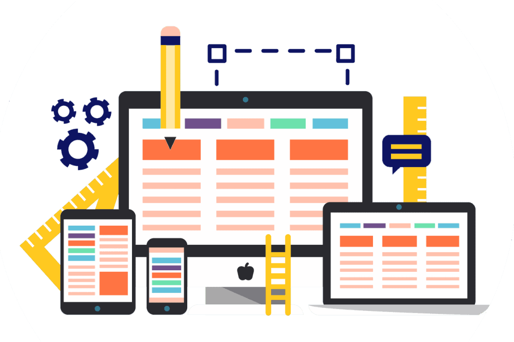
Data sharing, communication, and business are all happening online nowadays and everyone wants to retain their users by providing the best experience possible. Visual and graphic design has become much more important and has evolved into UI design which in turn has become one of the tools developers use in order to increase traffic to websites.
White space is just as important as it was 10 years ago and is still impacts UI design even today.
Here is how white space impacts the efficiency of UI design.
What is White Space?
White space is literally just the unmarked or unused space in visual design. We can see it between lines in a paragraph, layouts and other design components.
However, white space is not just the white color we see. It is basically the background we can see so it can be the texture, color, image or pattern on a layout.
Why Does White Space Matter In Design?
White space and spacing are important in the design of a website. Websites without white space can offer different effects such as creating a smoother feel, more engagement from your readers and changes in how your site functions.
The difference between an average and successful product can be seen in its design. As a designer, you should fulfill the client’s needs but also consider how average users will see the product.
White space enhances both UI and UX of a webpage. Here are factors that show why white space is important in UI/UX design.
Emphasizes Design Components

White space is important for giving our brains a moment of clarity. Our brains give importance to the design components using white space as the buffer that gives us enough time to process what we see.
We can view pictures in more detail with the use of white space. With this, you can understand what is happening in the picture. White space also provides a sufficient buffer for your brain to make sense of what you’re seeing.
Better Comprehension
Using white space makes content easily scannable and makes it easier to understand. According to research, white space between lines of paragraphs, left and right margins can increase comprehension up to 20%.
Guide User’s Eyes
White space can help guide your user’s eyes. For example, the first point is the logo, next is the navigation bar, then a hero image and then finally the text. You can do this by streamlining the content of your page to less than 15 points on that page.
When placing this content, you need to decide where the macro space will be located, that is, where on the screen you will place each group of elements or pieces of content. A macro space encloses each component or group of components. On the other hand, this space is the space that surrounds various components of the same group or between characters, lines, and paragraphs of text.
Maximize Interaction Rate
Studies have shown that the average attention span of Internet users is 6 seconds. Effective use of white space allows your UI design to quickly communicate your message to users and maximize opportunities for interaction with your call-to-action. So designers need to create lines of communication between users, and design and white space can help a lot.
Try checking the Google search engine homepage. The use of white space is very clear and clearly communicates the purpose of the search on the page.
Gestalt Principle of Proximity
The Gestalt Principle of Proximity Allows users to link closely related components to have the same functionality. To properly implement this principle, you need to ensure that the components associated with the group are close to each other.
For example, you can collect personal information such as name and address in one group, personalize it with some space, and then add another group of fields under credit card information.
Embraces Luxury and Sophistication

White space can be a major design element when used to create a specific look or feel. We associate a huge amount of white space with sophistication and luxury, so when used effectively, we can add that association to our designs.
Large number of graphic components reduces overall design cost. Instead, improve your design by adding more images. Margins allow you to focus on making your graphics better.
Enables Imagination
When people see the white space in your UI design, it lets their imagination run free, which elicits stronger emotional responses. The human brain has a basic need to evaluate things, which creates a kind of narrative between what you see and how you can process it.
It is not so important that our minds mark the empty space. Just thinking about it involves our minds, and that’s important. By participating, you are becoming invested in the design. Becoming involved in the design makes a good first impression.
Highlights Visual Hierarchy
Using whitespace enables you show off the visible hierarchy among the different elements of your page. Consider increasing or lowering factors like margin and padding in order to add more focus on particular elements. Make sure to place important elements like CTAs in spaces where they can stand out.
Showcase Important Aspects
An experienced designer has to be able to guide his user’s awareness to the content material and make the message different. It is easy to be excessive when it comes to design. Designers have to keep away from unnecessary clutter in order to achieve the product’s end goal.
Simplicity doesn’t equate to a boring layout; rather, it`s a strong layout that speaks for itself in preference in catching the audience’s attention.
Takeaway

White space is the core element in website design. The lack of content is as important as the content’s presence on your website. It isn’t just an empty space; it’s actually a strong design tool.
White space creates balance, harmony and helps in brand designing. The idea here is to make the website look clean and simple and to highlight the details that visitors will enjoy.
White space isn’t blank space. It is a design element that allows the details on a web page to become enhanced. White space balances everything out and makes us see the design aesthetic. It also highlights the layout of the page so that the images and text are highlighted for better communication.
The post Importance of White Space In UI Design appeared first on Creativ Digital.
from Creativ Digital https://ift.tt/PCpY5ry
No comments:
Post a Comment