When you take a look at apps today, you will immediately notice that many of them sport vibrant, polished and more immersive designs. But at the same time, many app designers are following a more retro look with pixelated fonts and throw-back color schemes for a more nostalgic look.
As take a more bigger and important role in our lives, their designs have reflected how we interact with them. Get ready to see what’s coming to your gadgets this 2020. Here are some of the coolest design trends for the new decade.
Illustrations
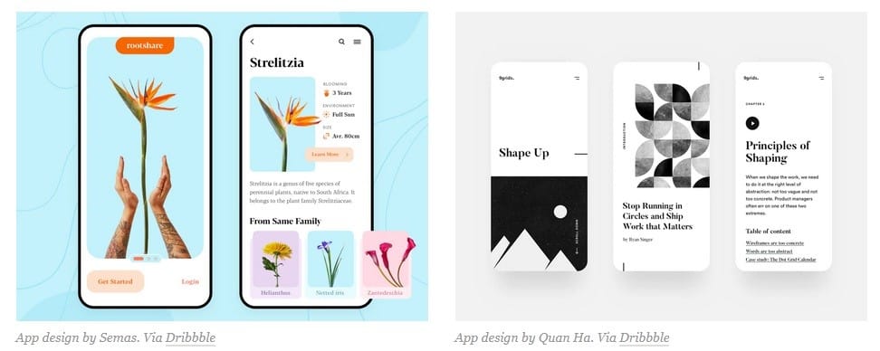
Expect to see more illustrations to take center stage this 2020. We’re not talking about graphics but illustrations that showcase works of art. You can expect to see flat to semi-flat illustrations with eye catching pallets.
Web designers are turning to illustrations more because they are more eye-catching compared to images. Illustrations also feel more organic than a photo or graphic. By giving viewers a more organic feel they are more comfortable and more comfortable with the environment.
Serif Fonts
Apps have always been dominated by the Sans Serif fonts. But in 2020, that’s changing. Sans Serif will still be here but they will be relegated to a minor role to give Serif fonts top billing.

Using 2 kinds of fonts creates visual hierarchy that can separate headlines from text. This is very important because apps are not just for games anymore. We use them to pay bills, monitor investments, use it to navigate traffic and foreign streets. As apps take a bigger role in our lives, serif fonts underscore their importance and visually give them the gravity they deserve.
Futuristic Colors
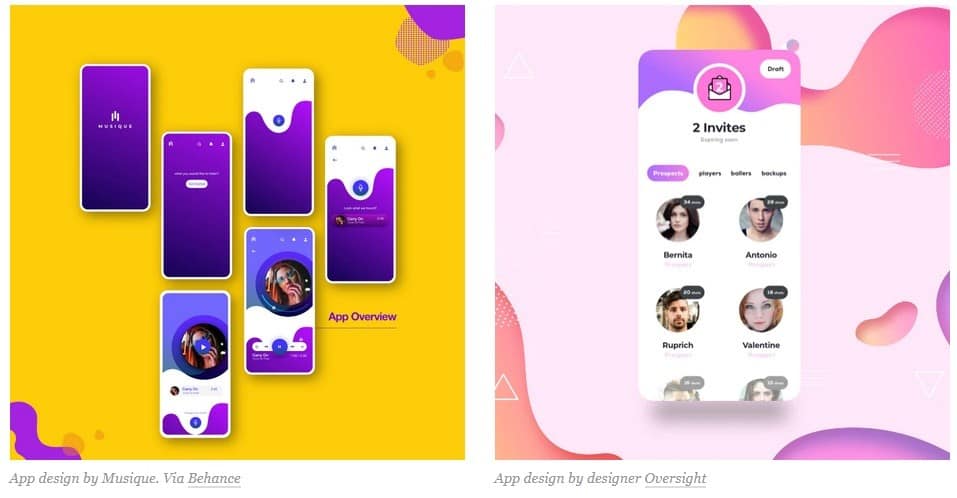
Another app trend for this new decade is futuristic color schemes. App designers are incorporating bright colors like purple, blue, pink and other neon colors to make their apps standout. This is because these colors are the colors of the future.
Aside from looking funky and cool, blues and purples really look good on today’s phones. Thanks to OLED technology these colors make an app pop. Imagine using it in your personal blog, purple will really standout especially with peach and pink gradients.
Transparent Elements
Gradients are still very trendy and in 2020, they are going to be transparent and semi-transparent on your screen. When you can see through an image, it feels lightweight and that’s exactly the reason why this trend is going strong.
By making some design elements transparent designers are able to fit a lot of information on a page without making it look heavy and cluttered. This is very important because you only have a limited screen size on gadgets like your smartphone.
Rounded Graphic Shapes
Rounded shapes are becoming trendy because they look softer and friendlier. This type of shape makes cold sterile environments easier to interact with. Finance is one of the areas that are embracing a more rounded graphic design and they use this to subvert uncomfortable expectations.

Say good-bye to dark blue and gray squares and rectangle usually found in finance apps. Imbalance shapes with softer color palette in many more apps. Rounded shapes take all the fear and stress out of personal finance and makes it approachable, human and even fun.
Dark Mode
We spend a lot of time looking at our phones which can hurt and strain our eyes. Studies show that the average person spends 5 hours on his phone daily and this isn’t likely to change anytime soon. In 2020 app designers are adapting our habits by focusing on dark mode.
In dark mode, light text is contrasted against a dark background. Not only can this protect your eyes from strain. Dark mode will also prevent your batteries from draining faster.
In the rise of the use of dark mode we will also see more neon color schemes and glowing gradients to make elements standout.
App designers in Sydney can assist you on your app project. They understand and know which trends will work with your app so that you can access solutions for your project.
The post Cool App Design Trends For 2020 appeared first on .
from https://ift.tt/2TcPTLl
No comments:
Post a Comment