According to statistics provided by WeAreSocial.com 93% of internet users access the web through their phones. This means that your website can be seen by up to 3.5 billion people on their phones or tablet at any given time. This means that you should be working hard to optimize your online presence.
In this connection we would like to show you mobile design practices that are often overlooked but you need to be following. They will help streamline your visitor’s experience while maximizing your impact online.
Say Good-bye To NavBar
Real estate on a mobile device is at a premium. Every pixel costs money and a NavBar can eat away precious space. This means that you need to maximize every pixel and one way to do this is to do away with the NavBar.
NavBars on a desktop or laptop are very useful because they help visitors browse your website more easily. However, it can take up a ton of space on a mobile device which could have been put to use for images or content.
Now you might be asking how customers or guests are going to navigate. One of the ways to do this is by incorporating a hamburger menu. This type of navigation system allows users to pull out the menu like a drawer from the left side of the screen and show you items in the NavBar.
Important Elements Should Be Within Reach
How do you use your smartphone?
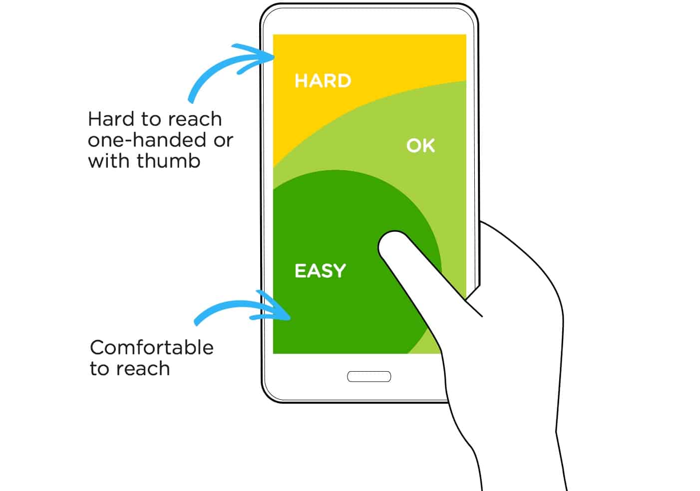
We use our phones all the time; while sitting on the bus, waiting in line at a Starbucks or while reading this article right now. How do you hold your phone? If you’re like most people you probably use your phone with one hand and use your thumb to navigate and browse.

According to mobile UX expert Steve Hoober, 75% of people use their thumbs to interact on their phones.
Screens of mobile phones got bigger but our thumb size have remained the same. Therefore it is important to remember to keep key elements within thumb reach. Designers should organize content that puts primary interactions front and center with secondary and tertiary options at the top and bottom of the screen respectively.
Optimize and Minimize File Size
File sizes drastically impact load time as it directly affects user experience and search rankings. This is even more important on smartphones because connections aren’t always reliable. Visitors aren’t likely to wait if your website loads slowly so it’s important to minimize file size of images before uploading them to your website.
Sites and tools like TinyJPG, ImageOptim and Export for Web can help you minimize image size before uploading them onto the web.
Link Phone Numbers and Addresses
Mobile users want a streamlined experience so your web pages should be easy to access. This means that you should take advantage of interactions that make visiting your website a pleasant experience.
If you’re website sells products or if a phone number is an important touch point, one of the best things you can do is to make it easy for customers to call you. One of the best ways to make a contact us page valuable is to make phone numbers clickable. Please don’t make customers swipe back and forth across phone and browser apps to type in your number.
Making a phone number (and other important elements) clickable can make a big difference and all you need to do is to link it.
The same is true with your address. Customers who want to find you on Google Maps should be able to click your address without needing to copy-paste it on a browser. Little things like this can make customers feel in tune with your website and save them from doing extra work.
Disable Popups
Did you know that Google has a soft penalty for what they call “intrusive interstitials”?
This is what we laymen call popups and they can detract user experience because users are unable to see content they’ve clicked on. To stop this, Google has penalized websites with popups by downgrading their search rankings to discourage people from adding popups on their sites.
Just turn your popups off. If your popup is important just add as content in a section to stop Google from punishing you.
Optimize Forms For Mobile
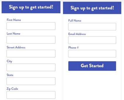
We all k now that answering forms on a mobile device can be very hard. While typing has drastically improved since the days of T9, it’s still not perfect and therefore frustrating to many. Long forms require a lot of typing but typing takes a lot of effort. Therefore, do away with long forms for mobile devices.
One way to do this is by reducing the number of form fields users need to fill up. Take a look at this example:

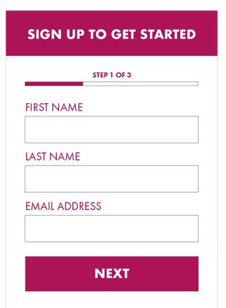
Another way is to break up the process into multiple steps. So if you have 9 fields put up 3 for the first step and after answering the form they are taken to the next page to fill up and so on.

These options makes converting on your form less intimidating while allowing you to collect lead information in small bits from your users. Always remember the easier to fill up the better so at minimum collect their email address so you can market to them in the future.
Use Collapsible Sections or Accordions
Content on a mobile device usually gets compressed into 1 column that makes it look longer. This is a big issue for mobile users because it’s going to be harder for them to find what they’re looking for.
An elegant solution for this problem is to use collapsible content sections, a.k.a accordions. These are essentially containers that hold content and only shows up as a header unless the user taps on them. This allows guests to skim through content without having to shift through tons of images and other information.
We hope that these design tips will make it easier for you to streamline user experience for your mobile website. These practices are often overlooked which can lead to a drop in sales and ranking. Following these tips will improve user experience and make it easier for you to convert.
The post Overlooked Mobile Design Practices You Need To Implement appeared first on .
from https://ift.tt/2CD6Iq0
No comments:
Post a Comment