We know that creating high-performing landing pages is hard. Landing pages need to look good and communicate your message at the same time. It’s hard to get people to visit your website but it’s even harder to keep their attention.
Here are some tips on how you can get their attention and keep them engaged until they click the CTA.
Keep Layout Clean
Nothing will drive people away faster from your website like a cluttered layout. Take a step back and look at your design objectively. Do you see harmonious symmetry or a barrage of chaotic images with dense blocks of text?
When thinking about a design for your website, text and images should come together logically to reinforce each other’s message. Cut out everything that’s unnecessary to the purpose of your page so that your message does not get lost in the layout.
Grab Attention & Keep It
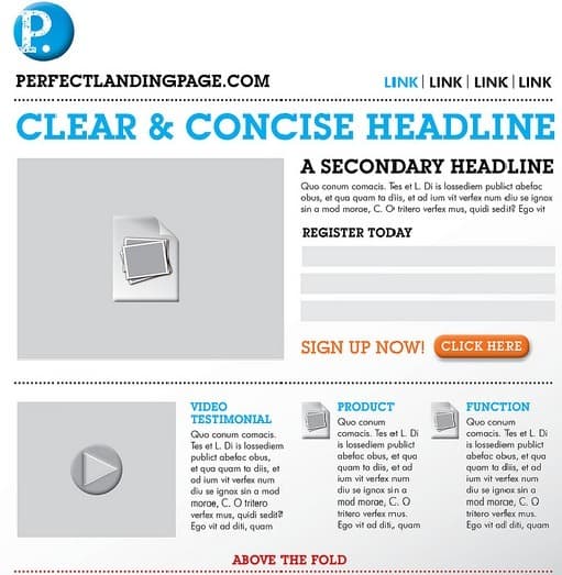
The content you place above the fold of your landing page can keep or break your visitor’s attention. This is because content creates an important first impression. Big hero images, attention grabbing headlines, dynamic background videos and engaging animation can hold their attention and keep them scrolling for more.
However, graphics can only keep attention for so long before guests will wonder what else is there to see. This is why you need informative, engaging and logically organized content. You want guests to keep on reading instead of just looking at cool animation and videos.
Always keep in mind that your page has a goal: to get visitors to click the CTA.


If you have too many CTAs, confusing navigation and other distracting elements people will lose focus and cause them to forget that one key action you wanted them to make.
It’s okay to have many links and images so long as they don’t distract people towards that action you want them to take.
For instance some landing pages have a “learn more” link next to the main CTA. This is usually makes people further down the page to get more info about the product or service. Just make sure that this part contains relevant information that makes them take action.
Gamify Your Landing Page
Gamify-ing something means adding elements of game-play in a context or format where they aren’t normally used.
In the case of landing pages, gamify-ing means communicating your message in an entertaining way. Always remember that you want guests to get educated and entertained because you’re not just selling a product.
Take a look at Google Doodle. While it’s true that Google is a search engine and not a landing page, the team behind this idea adds the element of fun and learning to searching. Users have the chance to play Moog synthesizer, decode a message using a Turning machine and chomp up ghosts in Pac-man.
Teach, Don’t Sell
If your page sounds like a person selling vacuum cleaners door to door, you’re going to send people to your competitors.
Always remember that people come to your website because they have a problem that you might be able to solve. Your page should be able to tell them how your product or service can benefit them.
Your page should also be able to tell them how your product works or show them the process of how to use it. Whatever method you use, it should be short and easy to understand.
Teaching people about your product in a simple way is one of the easiest ways to earn customer’s trust. People will want to buy your product if you can demonstrate how to use it and the benefits of using it without using fluffy marketing language.
Share Your Hope For Sharing
Now that we know you’re product is awesome, you’re probably wondering how you can share this awesomeness to other people.
Don’t be afraid to include social media buttons in your landing page. This will encourage others to share your website on social media networks.
Only include social media buttons that you’re active in. For example, if you have a huge following on Facebook, it’s perfectly alright to include this button only in your site.

If you’re a bit shy to ask people to share, incentivize sharing to give people a reason to share. For example, if you have a waiting list for your product let people know that a share will bump them up the list. Perhaps you can include a link limited version of something if they share on social media.
Harness the Power of Statistics
We all know that stats on the web mean nothing. Who are the 3 out of 4 dentists that recommend this toothpaste? Why is there a 7% increase in median home prices? How did they know that humans only use 90% of their brain power?
It’s easy to put up numbers on a page but meaningful statistics sourced from customer survey can provide proof of satisfaction.
Statistics provided by your actual customers can give you an honest and effective way of showing value to what you’re offering.
How many feel that you product has made them more efficient in their jobs? What percentage agrees that your product has improved co-worker communication? How many people agree that your product works as advertised?
Design & Write For Your Audience
Who is your target market? Are they moms, coders, model train enthusiasts?
Do your research. Learn your target market’s idioms and jargon. Your page will look and sound more authentic if you sound like them. For instance a pair of sneakers might be described as “dope” but not a model train.
Write in a language and tone they can relate to. You can pull off this kind of info from Google Analytics and use it to shape the content that can connect you most easily to your target market.
Keep Up The Convo
Truman Capote said “a conversation is a dialogue, not a monologue”.
People who make landing pages can easily get lost in content, graphics, typography and other design matters they sometimes forget about what happens after people act.
Depending on the nature of your page, you can keep the conversation going by sending them an email or request for social sharing or maybe a secondary product pitch.

The bottom line is that your landing page should make it easy for people to act. CTAs that win are CTAs that are easy to act on. Always remember that nobody wants to scroll all the way down your wonderfully long landing page just to sign up.
Make your CTA “sticky” so that it remains in place as people scroll through. This minimizes the time and effort required to get on board. The cardinal rule of UX is: the less effort it takes to get people on board, the happier they are to do it. So make sure your CTAs are frictionless so that your conversion rates soar.
The post Land Page Design Tips To Improve UX & Conversion appeared first on .
from http://bit.ly/2T7aVIt
No comments:
Post a Comment