Front end development is focusing more and more on efficiency. Pre-processors like Less and SCSS make the job easier for many programmers but there are many ways to write minimal quick CSS the native way. Luckily we have some tips below to help you eliminate the many duplicate rules and overrides. They will help you standardize the flow of styling in your layouts and help you create a personal starting framework that’s efficient and solves many starting problems.
Use CSS Reset
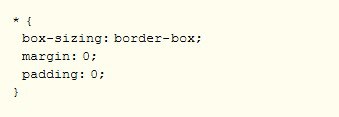
Reset libraries like normalize.css can provide a clean slate for your site’s styles to help ensure better consistency between browsers. Most sites don’t need all the rules libraries include so you can usually get by with removing all the margins and paddings applied to your elements in your layout.

The use of box-sizing declaration is optional.
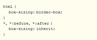
Inherit box-sizing
Box sizing can be inherited from html.

Box sizing is easier to change when code is introduced through a 3rd party plugin or application that use different behavior.
Use Flexbox To Get Rid Of Margin Hacks
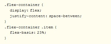
Get rid of nth-, first-, and last-child hacks by using the space-between property value in flexbox.
This will prevent you from having to clear or reset margins to get the columns to break into the number of rows you want when you’re designing a grid like a portfolio or image gallery where you used floats.

Use :not() to Style Borders on Lists
Using last-child or :nth-child selectors is a very common practice in web design especially when you want to undo a style previously declared on the parent sector. Create a separator between each link and the second rule added to take that border off the end:

This can become messy because it forces the browser to render things one way the undo for a specific selector. Resetting styles is unavoidable but :not() using pseudo-class to only apply a style to the elements you want in one single statement:

Add line-height to body
Repeating declarations over and over again leads to inefficient style sheets. Once you get the hang of planning your projects and combining the rules, your CSS will become fluid. One way to understand cascade and how the styles you write can be inherited elsewhere. Line height is one of the properties you can set for your entire project.
But instead of adding line-height to each <p>, <h*> and so on, add it to body:

There is no unit declared here. It just tells you to make the line 1.5 times higher than font size for the rendered text.
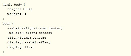
Vertically-Center Anything
A vertically centered layout is a great way to set an elegant foundation for content layouts.

Use SVG for Icons
SVG scales is important for all browser types so ditch your png, .jpg, or .gif-jif- files for SVG Icon Fonts in FontAwesome 5.
Maintain accessibility with:

Use the “Owl” Selector
Use universal selector (*) and adjacent sibling selector (+) to provide powerful CSS capability that will allow you to set rules for all elements in the flow of the document that specifically follow other elements.

This will help you create a more uniform spacing.
Consistent Vertical Rhythm
Provide a visual aesthetic with consistent vertical rhythm. This will make content more readable where owl selector might be too general. Use a universal selector (*) within an element to create a consistent vertical rhythm for specific sections of your layout:

We hope that some of these tips will make your CSS more fluid.
What do you think of our tips? Did they make your coding easier? Tell us by leaving your comments below.
The post CSS Tips To Level Up Your Skills appeared first on .
from https://ift.tt/2SAe4Qy
No comments:
Post a Comment