Thursday, December 13, 2018

How To Password Protect Your WordPress Site’s Content

Approximately half of the world’s websites run on WordPress. With millions of people using WordPress to share information, security is always paramount.

WordPress is easy to use and gives you control over your content and there might be cases where you would like to share content with selected individuals. Perhaps you would like to share a wedding album to your guests or share articles with your subscribers.

Whether you want to protect your whole website or restrict users, you can DIY security by following these simple steps.

Protecting A Post Or Page

You can protect a post or page on a WordPress site by installing plugins. WordPress packs functionality that lets you control information that you share with visitors.

You can password protect a post or page by following these steps.

  • Go to: Posts > All Posts from the dashboard.
  • Find the post you want to protect and open it using Edit.
  • Go to the right sidebar to the Publish section then click the Edit link.
  • There Should be 3 different options: public, private and password protected.
  • Click password protected and enter a password. Once you’re done click the OK button to proceed.
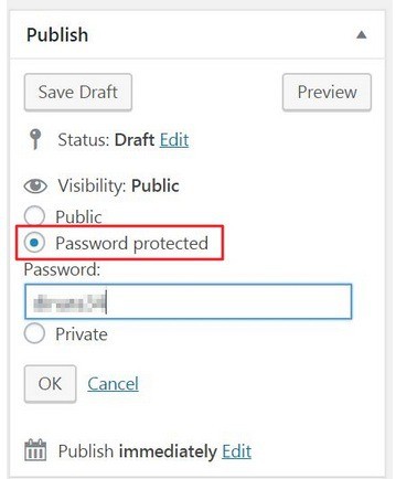
This post will now be visible only to users who enter the password you set.

Password Protecting Parts Of A Page Or Post

The Passater Plugin is the easiest way to restrict user access to a portion of a post or page.

Activate the plugin and then put a shortcode before and after the content block you’d like to restrict access to. Whenever someone wants to view the post, they will have to enter the password you set on the password protected content.
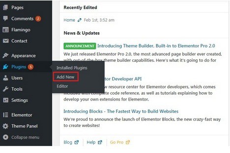
To activate Passater:

  • Go to Plugins > Add New
  • Search for Passater plugin. Click it once it shows up in the results.
  • Click on the Install Now button to install to your site.
  • After it’s done installing, click Activate button.
  • Open the post you would like to password protect. Select the chunk of text you want to protect.
  • Select Content Protector Shortcode option that’s added to the text editor.
  • A popup window should prompt you to enter a password.

  • Enter the password you’d like to use to restrict access to your content and click the INSERT SHORTCODE button to proceed.
  • The chunk of content you selected should be wrapped around the shortcode and should look something like this:

[content_protector password=”your-password”]Your password protected content here.[/content_protector].

  • Click the Update (or Publish) button to save changes.

Protecting A Category Of Posts

You can also password protect a category of posts.

  • Start by using Access Category Password plugin to restrict user access to a specific category of posts.
  • Go to your website admin panel and go to Plugins > Add New.
  • Search for Access Category Password plugin. Once it shows up click Install.
  • After installing, click Activate.
  • Hover over Settings in the sidebar menu, and click on the Access Category Password option in the sub-menu.

  • You will be redirected to the Access Category Password settings page.
  • Enter desired password and set categories of posts you want to protect using the Impacted categories option.

Once you save changes, the category of posts you selected should be password protected.

Password Protecting Your Entire Site

To password protect your entire site; use the Password Protected plugin for WordPress.

  • Go to Plugins > Add New.
  • Search for the Password Protected plugin. Once it shows up in the search results, click on the Install Now button to install it to your website.
  • Activate after installing.
  • Go to Settings and click Password Protected. You will be redirected to the Password Protected Settings page.

You are now presented with some options.

  • To protect your entire site: tick the Enable checkbox in front of the Password Protect Status option.
  • Ticking the Protected Permissions option allows selected visitors to access your website without having to enter a password.
  • To allow specific users to access your website without permission simply enter their IP addresses in the text box in Allow IP Addresses text box to whitelist them.

Website owners and e-commerce site owners will find themselves in situations where they will need to password protect certain content on their website. Knowing that they have this option will help them keep their content and website safe.

Is your website password protected? What do you think are the benefits of password protecting a website or its content? Tell us by leaving your comments below.

The post How To Password Protect Your WordPress Site’s Content appeared first on .


from https://ift.tt/2QRo5eR

Tuesday, December 11, 2018

CSS Tips To Level Up Your Skills

Front end development is focusing more and more on efficiency. Pre-processors like Less and SCSS make the job easier for many programmers but there are many ways to write minimal quick CSS the native way. Luckily we have some tips below to help you eliminate the many duplicate rules and overrides. They will help you standardize the flow of styling in your layouts and help you create a personal starting framework that’s efficient and solves many starting problems.

Use CSS Reset

Reset libraries like normalize.css can provide a clean slate for your site’s styles to help ensure better consistency between browsers. Most sites don’t need all the rules libraries include so you can usually get by with removing all the margins and paddings applied to your elements in your layout.

The use of box-sizing declaration is optional.

Inherit box-sizing

Box sizing can be inherited from html.

Box sizing is easier to change when code is introduced through a 3rd party plugin or application that use different behavior.

Use Flexbox To Get Rid Of Margin Hacks

Get rid of nth-, first-, and last-child hacks by using the space-between property value in flexbox.

This will prevent you from having to clear or reset margins to get the columns to break into the number of rows you want when you’re designing a grid like a portfolio or image gallery where you used floats.

Use :not() to Style Borders on Lists

Using last-child or :nth-child selectors is a very common practice in web design especially when you want to undo a style previously declared on the parent sector. Create a separator between each link and the second rule added to take that border off the end:

This can become messy because it forces the browser to render things one way the undo for a specific selector. Resetting styles is unavoidable but :not() using pseudo-class to only apply a style to the elements you want in one single statement:


Add line-height to body

Repeating declarations over and over again leads to inefficient style sheets. Once you get the hang of planning your projects and combining the rules, your CSS will become fluid. One way to understand cascade and how the styles you write can be inherited elsewhere. Line height is one of the properties you can set for your entire project.

But instead of adding line-height to each <p>, <h*> and so on, add it to body:

There is no unit declared here. It just tells you to make the line 1.5 times higher than font size for the rendered text.

Vertically-Center Anything

A vertically centered layout is a great way to set an elegant foundation for content layouts.

Use SVG for Icons

SVG scales is important for all browser types so ditch your png, .jpg, or .gif-jif- files for SVG Icon Fonts in FontAwesome 5.

Maintain accessibility with:

Use the “Owl” Selector

Use universal selector (*) and adjacent sibling selector (+) to provide powerful CSS capability that will allow you to set rules for all elements in the flow of the document that specifically follow other elements.

This will help you create a more uniform spacing.

Consistent Vertical Rhythm

Provide a visual aesthetic with consistent vertical rhythm. This will make content more readable where owl selector might be too general. Use a universal selector (*) within an element to create a consistent vertical rhythm for specific sections of your layout:

We hope that some of these tips will make your CSS more fluid.

What do you think of our tips? Did they make your coding easier? Tell us by leaving your comments below.

The post CSS Tips To Level Up Your Skills appeared first on .


from https://ift.tt/2SAe4Qy

Keynote or PowerPoint: Which App To Choose For Presentations?

When it’s presentation time, using the right kind of software can make the job easier. For PC users, the choice is obviously PowerPoint but Mac users have another option: Keynote. So which one do you choose? They’re both great for different uses. This article will talk about the pros and cons of the two software to find out which one is suitable for your needs.

Keynote

Keynote is designed for Apple devices. It works on their computer, tablet and phones using the iOS software.

This program allows users to create sleek presentations with its easy to use tools and intuitive design. The side navigator has options for designing slides and different layouts, animations, fonts. Keynote is also able to make presentations from other software.

Keynote Pros

  • User friendly.
  • Lots of themes to choose from.
  • Basic setup lets you align and position elements for a sleek looking design.
  • Can be used for different types of multi-media like sound, video and other file types.
  • Great integration across different devices.
  • Polished animation, transition and transparency effects.
  • Software is free for all iOS devices.
  • Photo manipulation tools like cropping is easier in Keynote.
  • Lots of extra templates you can download.
  • More polished overall aesthetic.

Keynote Cons

  • Not highly adopted as other programs.
  • Does not support 3D effects.
  • Learning curve if you’re coming from software.

Choose Keynote if you’re a Mac user and want to make your presentations look like PowerPoint. It is relatively easy to use and comes installed with your OS. It’s a good option for creating presentations.

PowerPoint

 PowerPoint is probably the most popular presentation software in the world. When it comes to going head to head with other tools like Keynote, ease of use is always the biggest consideration. If you’ve been using PowerPoint for a long time, switching to Keynote might not be easy for you.

PowerPoint was originally designed for PC and is now part of the Microsoft Office Suite. It works on PC and Apple devices. Keynote works well on mobile devices but PowerPoint is more limited to creating presentations on your desktop.

PowerPoint Pros

  • Thousands of themes and templates.
  • Editing is easy thanks to drag and drop interface.
  • Easy and seamless integration with MS Word and Excel.
  • Slides can be converted to handouts and look really great.
  • Easy data and chart integration for building quick graphic works.
  • Advanced functions provide a lot of control for pro users that can control almost any aspect of the design.
  •  Smart design suggestion can help you create more visually appealing slides.

PowerPoint Cons

  • Adding multi-media can be flaky.
  • Cropping and photo editing can be tedious.
  • It’s easy to create bad design with garish animation with just 1 click.
  • It’s not free.
  • There are a lot of unneeded functions that get in the way.

Use PowerPoint if it’s the best option for your working environment where people are used to collaborating on PowerPoint. It’s the go to option for people who don’t use Mac. It’s compatible with any type of computer since the slides will work.  It’s also preferable if you’re bringing complex data into charts or slides because it is integrated with Excel.

Conclusion

If your working environment is composed of people who do a lot of presentations, it’s probably a good idea to have everybody comfortable with both Keynote and PowerPoint. If you have an option, Keynote is a good choice if you’re working in slides without massive amounts of data and PowerPoint is preferable when working with charts and numbers.

Do you prefer Keynote or PowerPoint? Which tool are you most comfortable with? Tell us by leaving your comments below.

The post Keynote or PowerPoint: Which App To Choose For Presentations? appeared first on .


from https://ift.tt/2QpWtyd

Thursday, December 6, 2018

Best Ways To Boost E-Commerce Conversion Rates

There are many ways to get people to visit your e-commerce site. But getting them to go to your website is just half the battle because the real one is to convert visitors into paying customers. According to Moz.com, average conversion rate for a typical e-commerce site is 1.6% and 92% of people who visit a website don’t make a purchase.

Unlike traffic, there is no direct way or a fool proof formula to boost conversion. All websites have to create an experience so that your website sells. There are also many different factors that influence a customer’s decision to buy. Website owners and webmasters need to be intentional and strategic in setting up the buying process so that your website converts.

Here are some of the best ways to boost e-commerce conversion rates.

Recommend Products Based on Customer Behavior

If you were in a real store, the salesman would not suggest products that were irrelevant to your choices. The same is true when it comes to interactions between your website and the customer.

There are many tools you can use that recommend products to customers based on their behavior. A good example is Unbxd which uses AI to analyze actions of users on your site to suggest the best products in the footer and sidebar automatically.

A/B Test Whenever Possible

Every single detail in your e-commerce store matters because they will want to make your visitors stay or go. Luckily unlike brick and mortar stores, it is very easy to make little changes on your website to test different options like CTA, content, header and footer options, buttons, colors and other details.

Constantly doing A/B testing can help increase your revenue because you can consistently improve the little details that can help or hinder the conversion process.

Reviews and Peer Generated Content

Almost all people who buy online read reviews first before making a purchase. According to a study conducted by the Spiegel Research Center, 95% of people read reviews before purchasing a product.

This means that including reviews can help boost conversion rates by aiding customers in making a decision on your site rather than searching elsewhere.

Amazon does a good job of not only including customer reviews and peer generated content. They also allow users to post photos of their purchase.

Customer Support

In a brick and mortar store, staff would be available to guide customers through the decision making process. However, in an e-commerce site, a customer usually decides by himself. All they have is your interface to help them figure out their options. This means that their experience in your website drives sales for you.

But customers have questions during the buying process and this is where customer support comes in handy because any unanswered question can cost you a sale. Studies suggest that 92% of customers feel satisfied when a website has a live chat feature.

Speed Up Your Site

Your website should not take more than 3 seconds to load. According to Hubspot, fast loading pages can deliver between 7-12% higher conversion rates compared to slower ones.

Luckily, this can be fixed easily by installing tools such as W3 Total Cache that can help you minify HTML, CSS, etc.

Include Exit Offers

90% of the visitors that come to your website for the first time are not coming back. This can be disheartening because you worked hard and paid for the traffic and it’s not making you money.

A good way to entice this type of visitor is to include exit offers to communicate with them and to convert them in the future. Tools like OptinMonk uses AI to determine when a guest is leaving your site and offers products based on their behavior. You can offer them a discount and get their email to make the sale later.

Remove Checkout Friction

Amazon has mastered the frictionless checkout. The more hoops customers jump through during a checkout process, the more likely they will abandon their shopping cart.

Always strive for a one-click-checkout. There are checkout plugins so that customers are taken directly to the checkout process. This is better compared to clicking multiple times or having popups disrupt or confuse customers.

Multiple Payment Options And Free Shipping

Free shipping used to be a perk but customers nowadays are expecting it (thanks Amazon).

Many customers don’t like to see their total go up because of shipping fees. Instead of letting customers see the shipping fee, include the cost of shipping on the items. Also include multiple payment options like Paypal and credit cards so that customers can choose the most convenient choice.

Taking a few extra steps to make sure that your customer experience is well designed and covers all the bases of customer service can boost conversion rates. Once you get the formula down, your growth can be exponential.

What do you think of our suggestions? Do you think they will work on your e-commerce site? Tell us by leaving your comment below.

The post Best Ways To Boost E-Commerce Conversion Rates appeared first on .


from https://ift.tt/2ATLPVL

Google’s Hour Of Code

Don’t have programming knowledge but want to learn? Try Google’s Hour Of Code and learn.

Students from all over the world can take part in Computer Science Education Week and the Hour of Code conducted by Google. There are a variety of coding challenges through super cool activities so that everybody can learn to code even though they have no prior knowledge.

The best part is that learners of all ages in more than 30 languages can participate. Teachers and parents can organize this learning activity for their kids to teach them the fundamentals of programming using different starter projects.

Activities in Hour Of Code are self-guided so that students can learn at their own pace. Students from all over the world have already spent over 100 million hours of code during the Computer Science Education Week.

There is also an unplugged version so that learners can still continue to learn the basics of coding without any device. Students who complete activities will receive certificates and badges.

Learning to code is important because jobs in the computer science field are rapidly increasing and there aren’t enough people with the required skills to fill up positions.

The main idea of Google’s Hour of Code is to give people the opportunity to learn coding skills no matter the age or career they are pursuing.

If you want to learn coding or want to help somebody learn, check out the curriculum now.

The post Google’s Hour Of Code appeared first on .


from https://ift.tt/2rpAnNg

Tuesday, December 4, 2018

Tracking iPhone Usage & Limiting Screen Time

Did you know that the average American smartphone user spends an average of 4 hours and 16 minutes glued to their screens? According to market research organization eMarketer, this statistic is alarming because mobile phones were supposed to help us connect with each other not isolate us from society.

If you think that your smartphone has been taking up most of your time, you’re in the right place because we can tell you how you can track your iPhone usage and limit your screen time. For iOS users there is actually an app usage tracker feature that can tell you the actual time spent on each app. This feature is at a place where you least expect it.

Check out the article below to find out your app usage statistics in iOS.

Here’s how to use the app tracker function on the iOS.

  • Go to settings>battery option

  • Go to battery usage by app section where you can find the percentage of battery consumed by every application installed on your device.

  • Tap the application you want to see for usage. You will be able to see onscreen time for all your apps. In the example below you can see that the app Gaana has a screen activity of 3 minutes and a background usage of 1 hour and 30 minutes.

On-screen time means which apps were running in the foreground while the time indicated as background are apps running in the background while your phone was locked or while you were using other features or apps of your phone.

There are other apps that have more “background” usage time because they are continuously running in the background performing tasks.

How To Check App Usage And Limit Screen Time

4 hours and 16 minutes is a frightening number because it defeats the purpose of the smartphone. Luckily there is an easy way to monitor app usage and limit your screen time.

In June this year, Apple announced that the iOS 12 has new tools to help customers understand and take control of their smartphone usage. The Activity Reports, App Limits and new Do Not Disturb and Notifications controls are designed consumers reduce and manage screen time for themselves and their families. This is a follow up on the parental controls installed by Apple in 2008 and the added features make it easier for individuals and parents set limits on device usage.

Do Not Disturb

Do Not Disturb is a powerful time management tool that can help you stay in the moment. There is also a Do Not Disturb for bedtime mode for better and uninterrupted sleep.

Screen Time

Screen time provides management tools for iOS users to control how much time they spend on their device. It can create daily and weekly activity reports that shows the total time a person spends on an app. By understanding how you interact with your app you and using the App Limit feature. You can set a specific time you can spend on the app and a notification will display how much time is left.

This is a great app for people who want to monitor their smartphone usage as well as limit their screen time. It’s a great tool not only for parents but also for individuals who are looking for ways to cut down smartphone use.

Do you know how much time you spend on your smartphone? Do you think you will be using an app tracking feature soon? Tell us by leaving your comments below.

The post Tracking iPhone Usage & Limiting Screen Time appeared first on .


from https://ift.tt/2BOWraa

5G Smartphone In 2019?

Reports have surfaced that Samsung and Verizon are in the talks for a 5G smartphone that is set to be unveiled in the first half of next year. The two companies are planning to present a proof of concept at the annual Qualcomm Snapdragon Technology Summit in Maui this week.

The device will feature Qualcomm’s unreleased processor together with Snapdragon X50 5G NR modem and Qualcomm antenna modules with integrated RF transceiver, RF front-end, and antenna elements.

Verizon stated in a press release that the phone is a result of years of collaboration to find a solution for commercial 5G service by using Samsung network equipment and personal devices.

Samsung on the other hand is also developing its own 5G modem Exynos 5100 which will probably be used for the international variants of the Samsung Galaxy S10 which will probably be running on Exynos processor.

5G connectivity will provide better bandwidth, improved connectivity and boost network reliability. Full implementation of 5G services by networks will offer more capacity and faster download speed compared to today’s 4G LTE network.

Leading smartphone manufacturers such as Nokia, Oppo and Lenovo are among the major brands that are starting work on their 5G smartphones.

Cellular networks in the United States are also racing to provide faster networks and are collaborating with cellphone manufacturers to create better handsets.

Verizon already provides 5G availability in 4 markets in the US and hopes to provide fully functional 5G mobile network in early 2019.

What do you think about 5G? Are you excited about this development? Tell us by leaving your comments below.

The post 5G Smartphone In 2019? appeared first on .


from https://ift.tt/2StXdiq