It’s 2018 and ‘tis the time to be done with the old and in with the new–new fonts and typography, that is.
Updating any form of graphic design, whether it’s for your branding, website, content, or what have you, is always exciting, especially when you’re incorporating new typography styles. So without further ado, here are 7 typography trends that you just can’t miss this new year!
1. Serifs for Sure
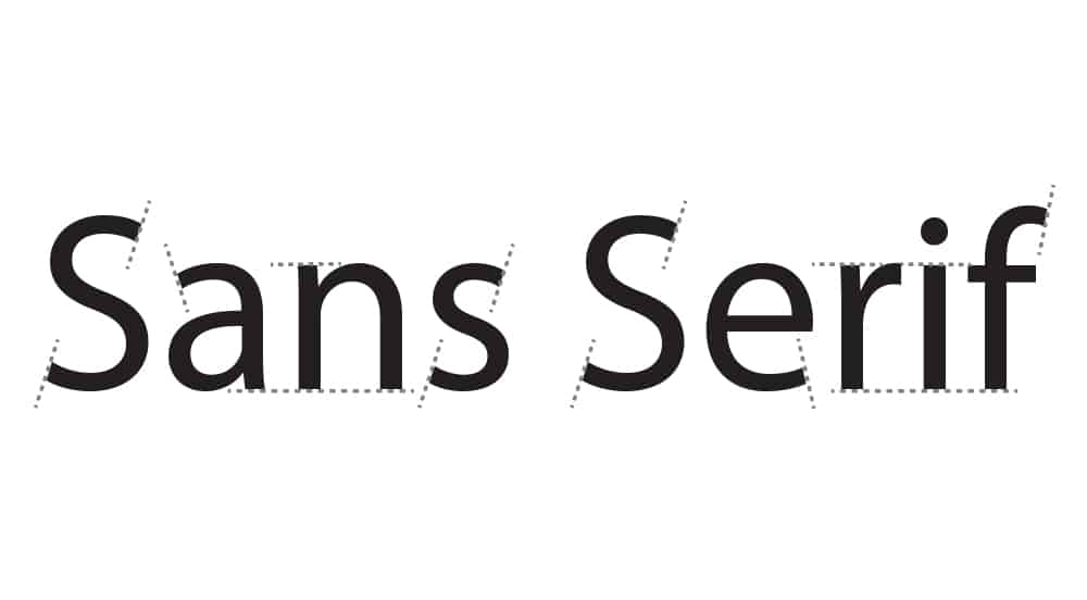
The Serifs are back in action. Expect it to be used with Sans Serif in a wide range of uses, which includes web pages, headings, body of text, and many more. Experts say that the Serif font reads faster than Helvetica, which is why we’re pretty sure to see more of Serifs dominating this year and probably even the next.
2. The Bigger, the Better
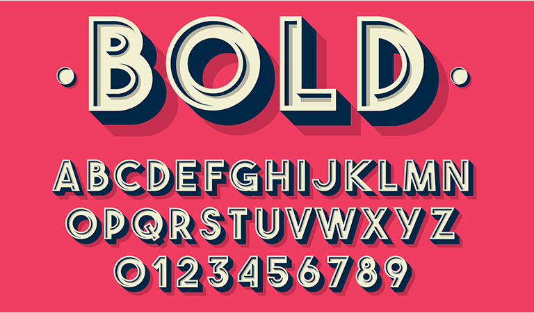
Prepare to stand out with bigger and bolder typography. Minimalism still remains somewhat prevalent but maximalism is well on its way to dominate. And what better way to join in the fun than by pushing the boundaries of design with big and bold typography that would allow your brand to really stand out from the crowd, right?
3. Calligraphy Makes the Cut
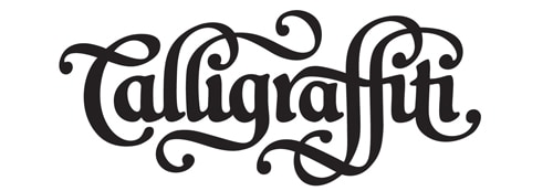
Calligraphy, particularly modern handwritten style, also gets its fair share of the spotlight this year. This kind of typography is more prevalent in logo design, which explains why even some of the biggest companies has been using this typography for quite some time now–case in point, Instagram.
4. Retro Returns
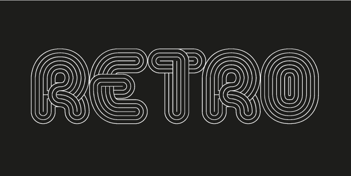
Let’s hear it for the return of vintage design as retro-inspired typography makes a huge comeback this year. Groovy fonts and typography that bring back that sense of funky and eclectic nostalgia are becoming more widely used, whether it’s for logo design or other forms of visual content across various platforms.
5. Colorful Craze
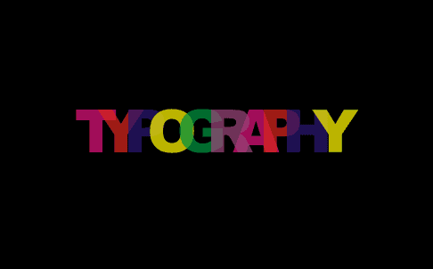
In line with maximalist design, we’re also bound to see more colors injected into various uses of typography. This allows brands to experiment more and let loose, giving them a chance to show more of their fun side, which would also make them a wee bit more relatable and accessible to their audience.
6. Customised Creations
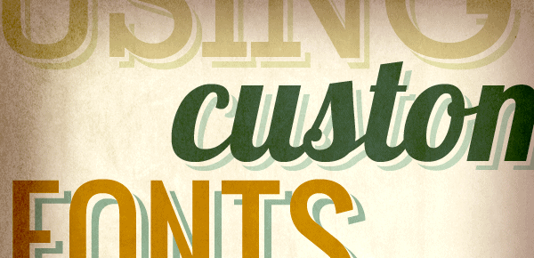
Brands that really want to step their game up go for customised typography, especially when it comes to their logos and signature branding aesthetic. This is a great move for those who want to really set their brand apart from the rest of the competition and make a more unique impression to customers.
7. Great With Gradients
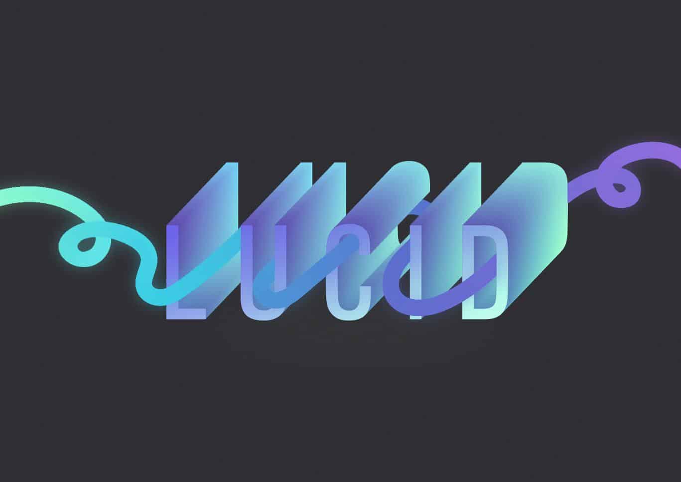
Gradient design is also making splashes this year with its mesmerising display of multi-colored or monochromatic hues that seamlessly blend into one another. Going beyond typography, gradient hues are also widely used in other design formats such as web design, social media content, and so on.
Which among these fun and funky typography trends are you most excited to use? We highly recommend mixing it up by combining two or more of these trends to create maximum impact for your branding materials!
The post Top 7 Typography Trends to Use This 2018 appeared first on .
from http://ift.tt/2onjQIp
No comments:
Post a Comment